How do you manifest the distinctive essence of a brand
AMEN answers this strategic question by uncovering the conceptual origin of a space or an institution. As an owner-led studio, we develop sophisticated, comprehensive design frameworks with a clear, content-driven focus on identity. We shape bespoke systems, systematically translating their narrative structure across both analog and digital environments.
*
*
*

*
*
Octane Capital
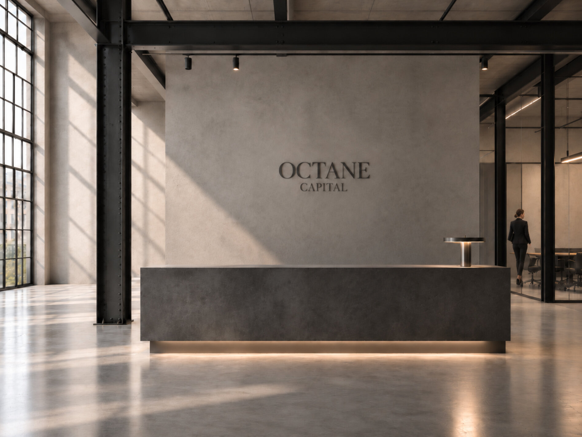
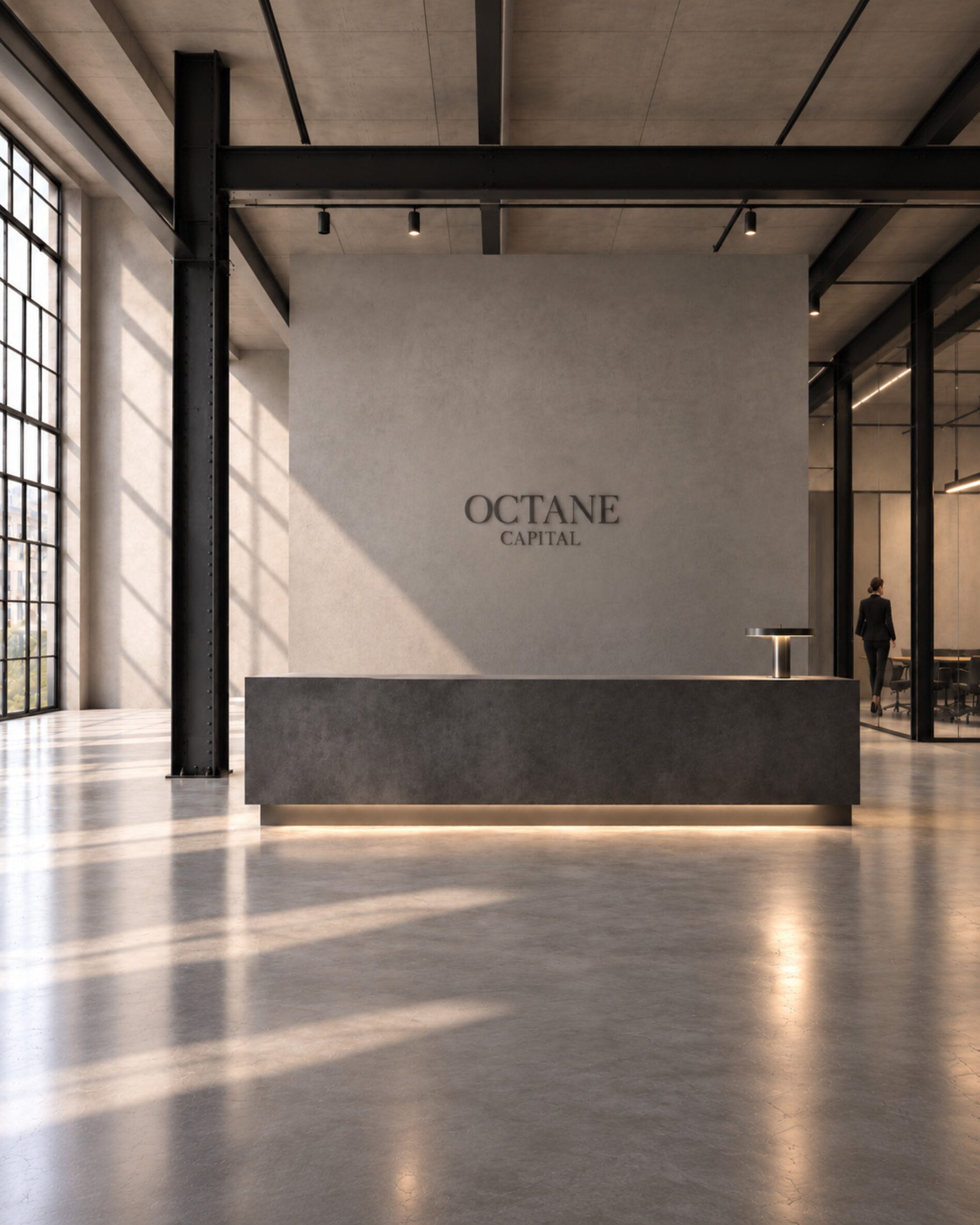
Capital as energy: The aesthetics of performance.
For the investment advisor Octane Capital, we developed the naming, the logo, and the corporate identity. The name stands for raw energy and the unstoppable acceleration of capital within complex market opportunities. A sophisticated serif typeface seamlessly links global sovereignty with deep, institutional trust. The visual framework perfectly captures the balance between traditional reliability and progressive financial performance.
*
*
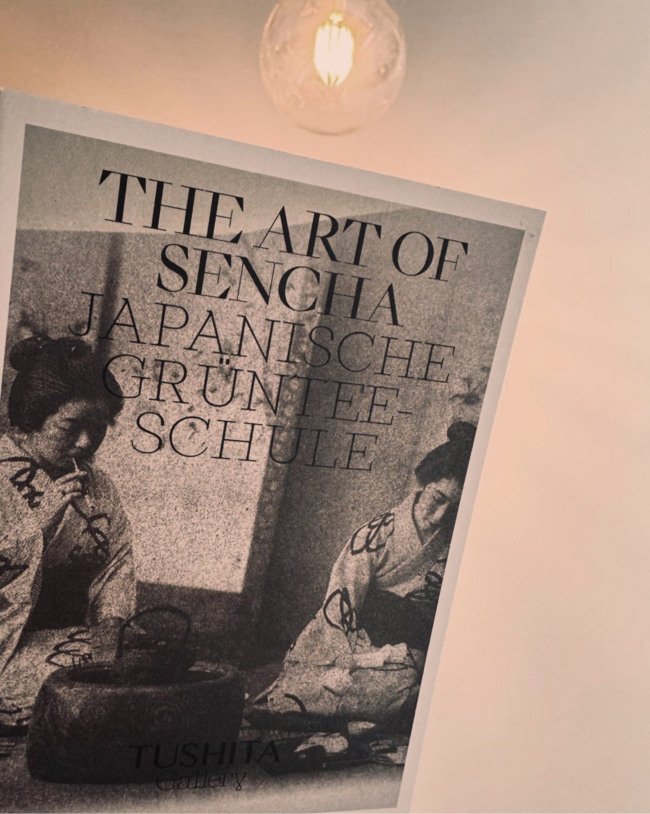
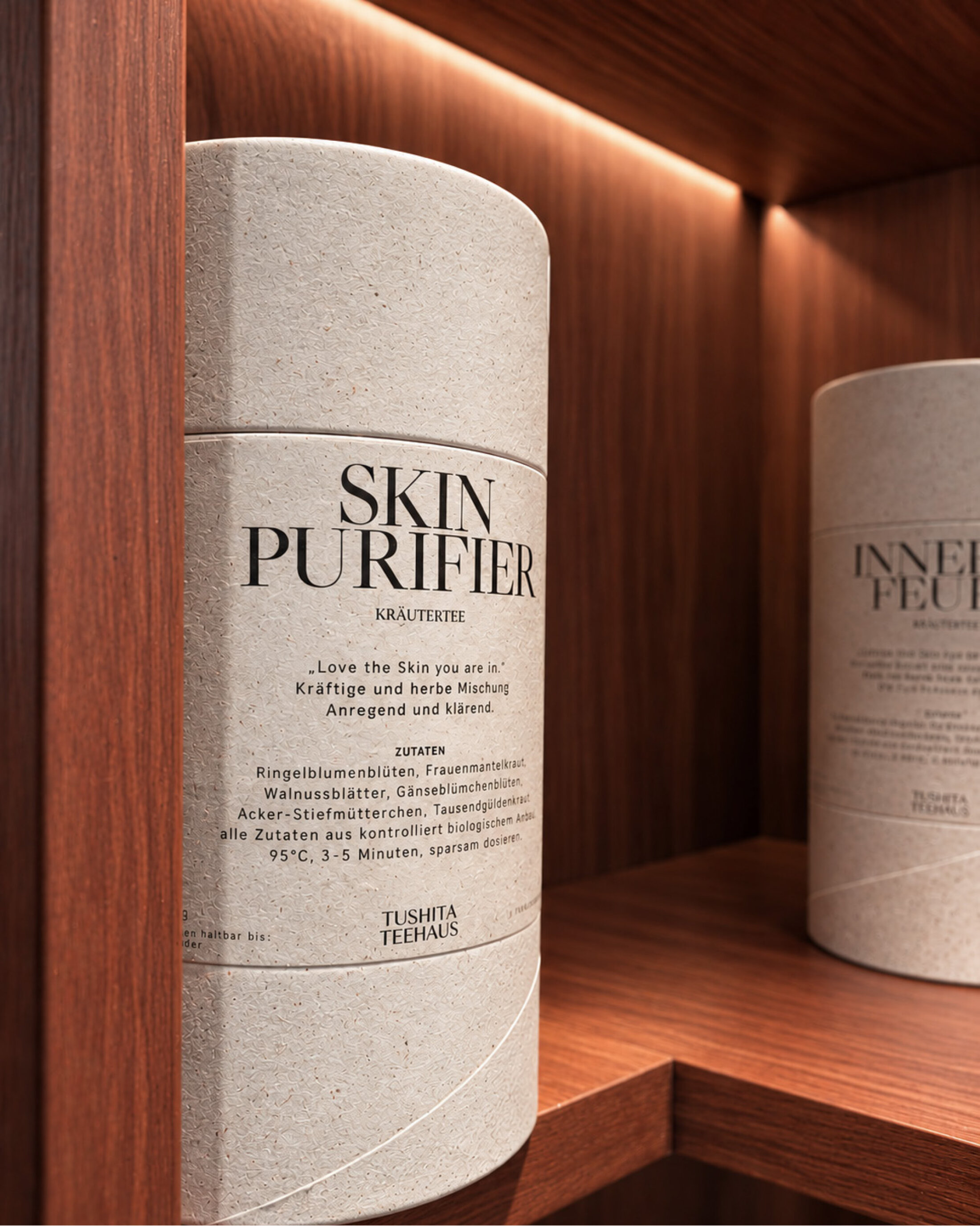
Tushita Teehaus
The echo of stillness: Japanese aesthetics in urban space.
For the Tushita Teehaus, we translated the deeply rooted philosophy of Japanese tea culture into a sophisticated, modern brand system. The visual identity relies on absolute reduction, the finest typographic nuances, and a meticulously balanced color concept that radiates calm and mindfulness. Every designed element celebrates the beauty of the fleeting moment and the Japanese principle of Wabi-Sabi.
*
*
NPN
Cultural synchronization: Identity as a network.
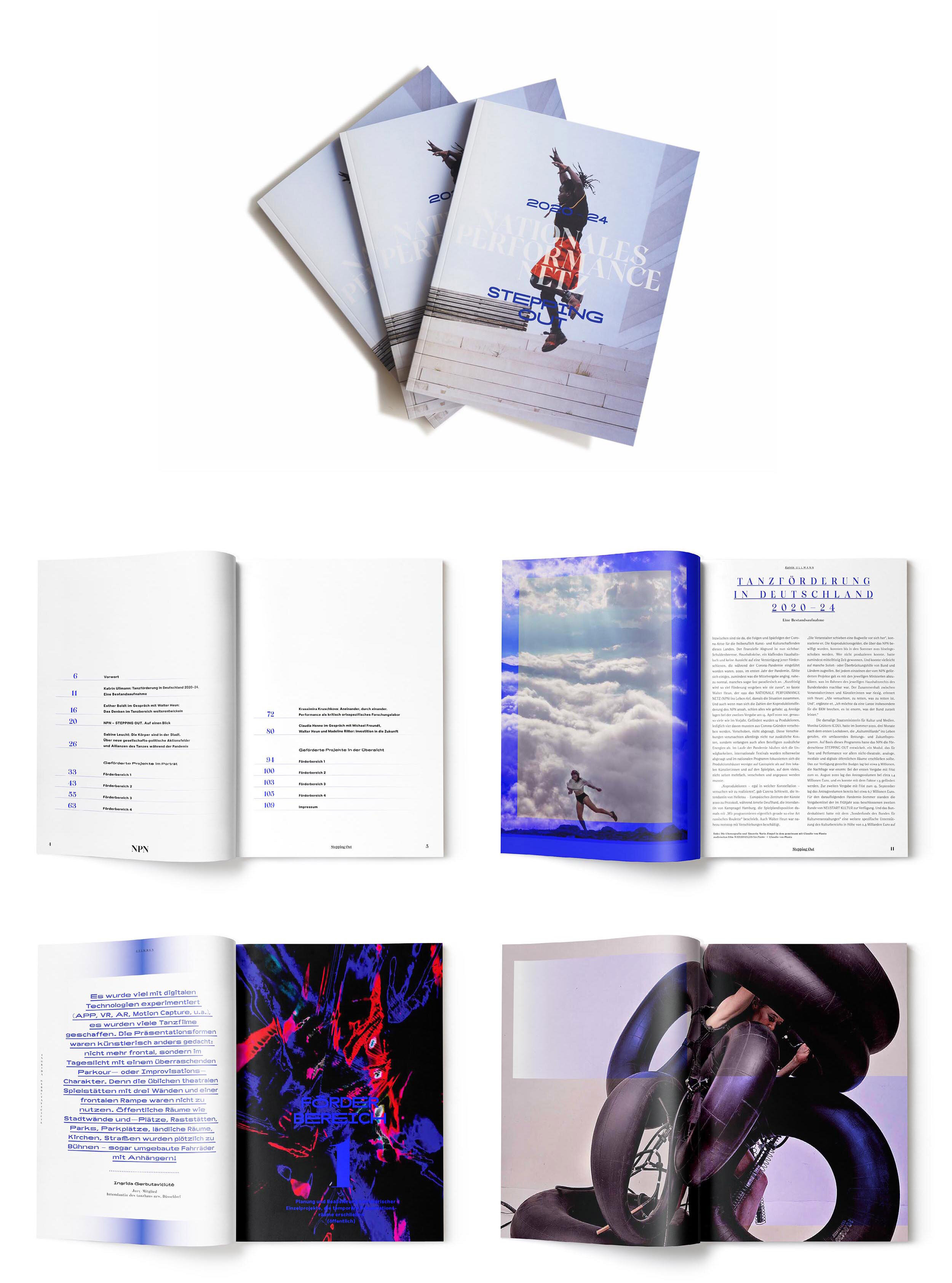
For the NPN (Nationales Performance Netz), we developed a visual and editorial identity that gives a clear structure to the dynamics of contemporary exchange. The design translates complex, transnational funding frameworks into a progressive grid and web ecosystem. Through precise typography and a fluid, rhythmic layout, the pioneering relevance of this network becomes instantly tangible – a visual stage for the avant-garde of dance and theater.
*
*
*
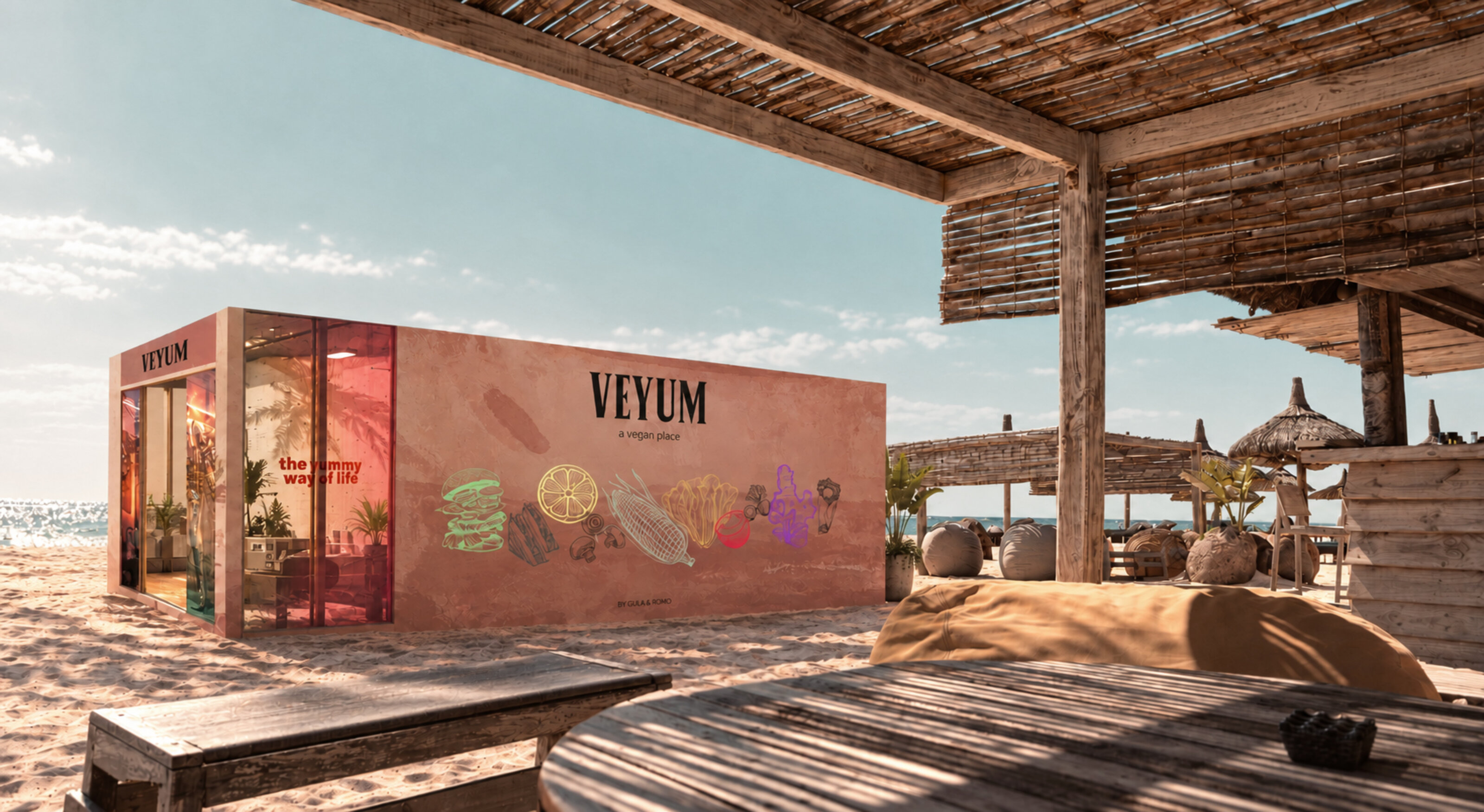
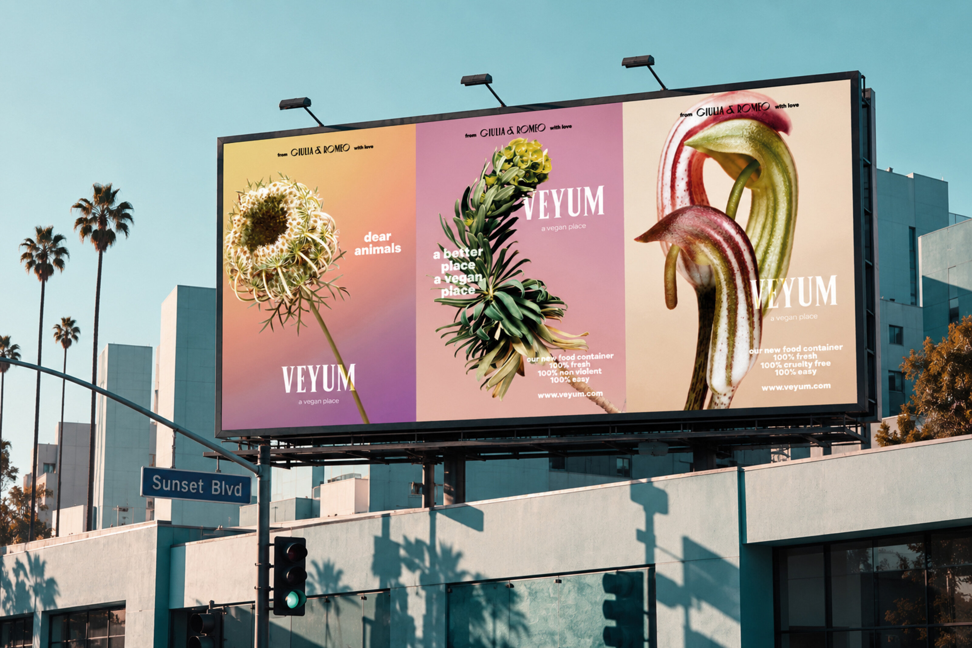
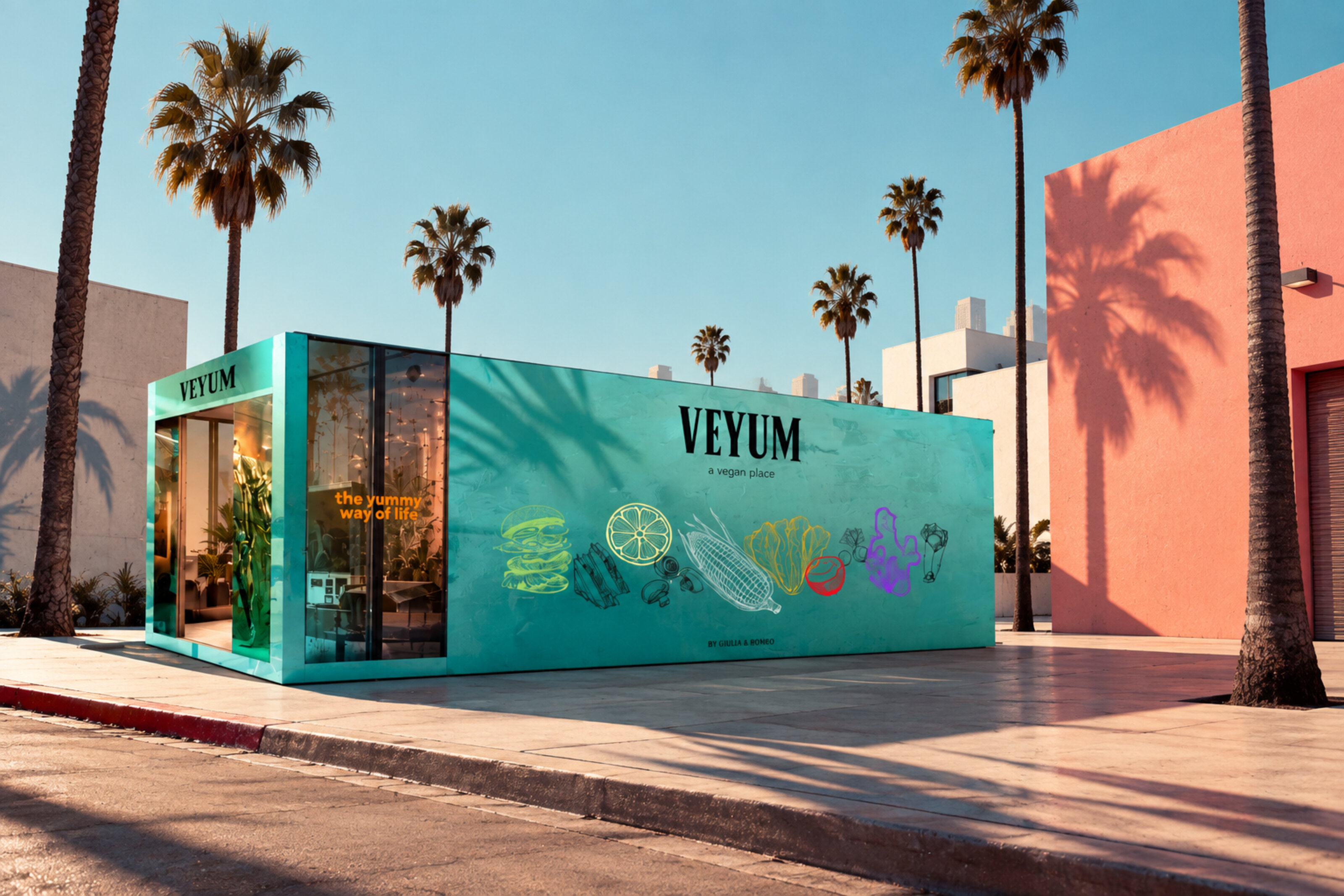
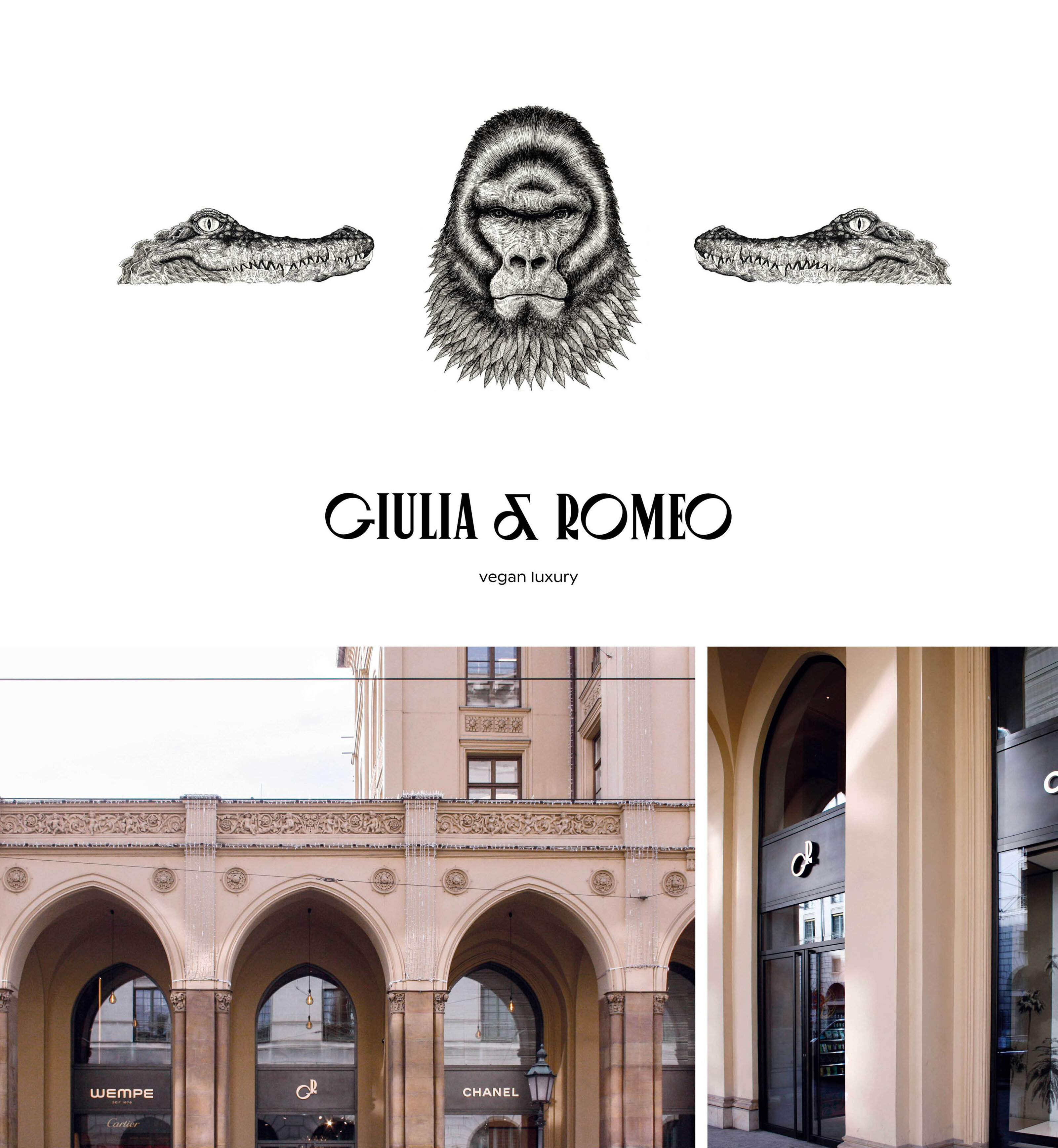
Veyum by Giulia & Romeo — Vegan Food Container
Architecture of taste: Naming & spatial branding.
What does progressiveness taste like? For Veyum, we curated the brand space from the ground up – from the strategic naming process to the space-defining design system. The brand operates as a minimalist grid, seamlessly fusing urban food culture, spatial presence, and visual identity into a progressive, modular unit.
*


TWE by Joint Adventures
Collective dynamics: The aesthetics of contemporary experiment.
For the Tanzwerkstatt Europa, we created a vibrant visual identity that channels the energy of international exchange, creation, and movement within urban space. The design is built on a lively, adaptable layout system and strong, expressive typography. The key visual reflects the convergence of theory, practice, and performance, creating a bold, far-reaching presence for one of Europe's most progressive dance festivals.
*


Kanzlei Wild
Strategic precision: Translating legal excellence into a commanding framework.
For the Munich-based specialist law firm Dr. Katharina Wild, we developed a comprehensive brand design and digital presence that translates legal excellence into a sovereign graphic framework. The visual identity reflects a core philosophy of uncompromising diligence. Through sharp, steadfast typography, a profound color palette, and a mathematically precise layout grid within the web design, the firm projects its scholarly standards directly into the digital realm. The accompanying portraits and visual assets capture a dense atmosphere of integrity and absolute discretion—a presence that derives its visual authority directly from the clarity of its structure.
*


8 Eden Avenue — Taktile Poesie: Die Inszenierung des textilen Gewebes.
Tactile poetry: Translating textile texture into physical and virtual spaces.
For the premium scarf label 8 Eden Avenue, we developed a refined system of packaging, hang tags, and digital presence. The visual language translates the precious texture and artisanal depth of the scarves seamlessly into both analog and virtual environments. Through a sophisticated typographic hierarchy and the tactility of unrefined papers, opening the packaging becomes a sensory prelude that renders the product's quality immediately tangible.
*


Friedrichskrone
A Belle Époque building on the corner of Friedrichstrasse and Kronenstrasse is being transformed into a contemporary office building, with its historic elements remaining part of the architecture – and becoming the starting point for our design.
The name was already there, hidden in the intersection: Friedrichskrone. We developed a visual identity that works with what the building already brings with it. The historic crown on the façade is finished in gold and reappears as a motif throughout the logo and signage. Typography, graphics and wayfinding pick up on forms and details of the building and bring them into the present.
Old and new sit quite close together here. The identity grew from exactly that.
*
Ruby Store
How does a visual identity bridge global avant-garde with local heritage?
The Ruby Store in Munich’s Gärtnerplatz district is renowned for its highly curated selection of international designer labels. The brand design we developed mirrors the core of this textile curation: it breaks away from conventional retail stereotypes, relying instead on an uncompromisingly clean identity system. The reduced visual framework allows the progressive silhouettes and textile textures the perfect space to unfold, anchoring the store as a distinct, creative constant within the urban landscape.

Bar Restaurant Kante, Berlin
How do you translate the versatile dynamics of a fluid culinary space into a coherent visual system?
The concept Kante unites restaurant, bar, and urban music culture on a single level into a vibrant, holistic experience. Our design framework captures this simultaneity, providing the space with distinct visual stability through a strict monochrome grid. At the core is the morphing 'K', which flexibly transitions into varying typefaces. This typographic interplay perfectly captures the venue's distinctive agility and deliberate openness to the new—an identity that organically accompanies the transformation of the space throughout the evening.
*


Alte Post
How do you transform a historic monument into a vibrant anchor within the urban landscape?
The revitalization of the imperial post office in Berlin-Neukölln was about far more than landmark preservation—it was about visualizing social transformation. We designed a visual identity that bridges historic substance with modern utility. From the symbolic icon of the peace dove on the facade to the precisely crafted leasing brochures and booklets: a holistic branding framework that completes the architectural transition and restores the building's enduring significance within the neighborhood.
*


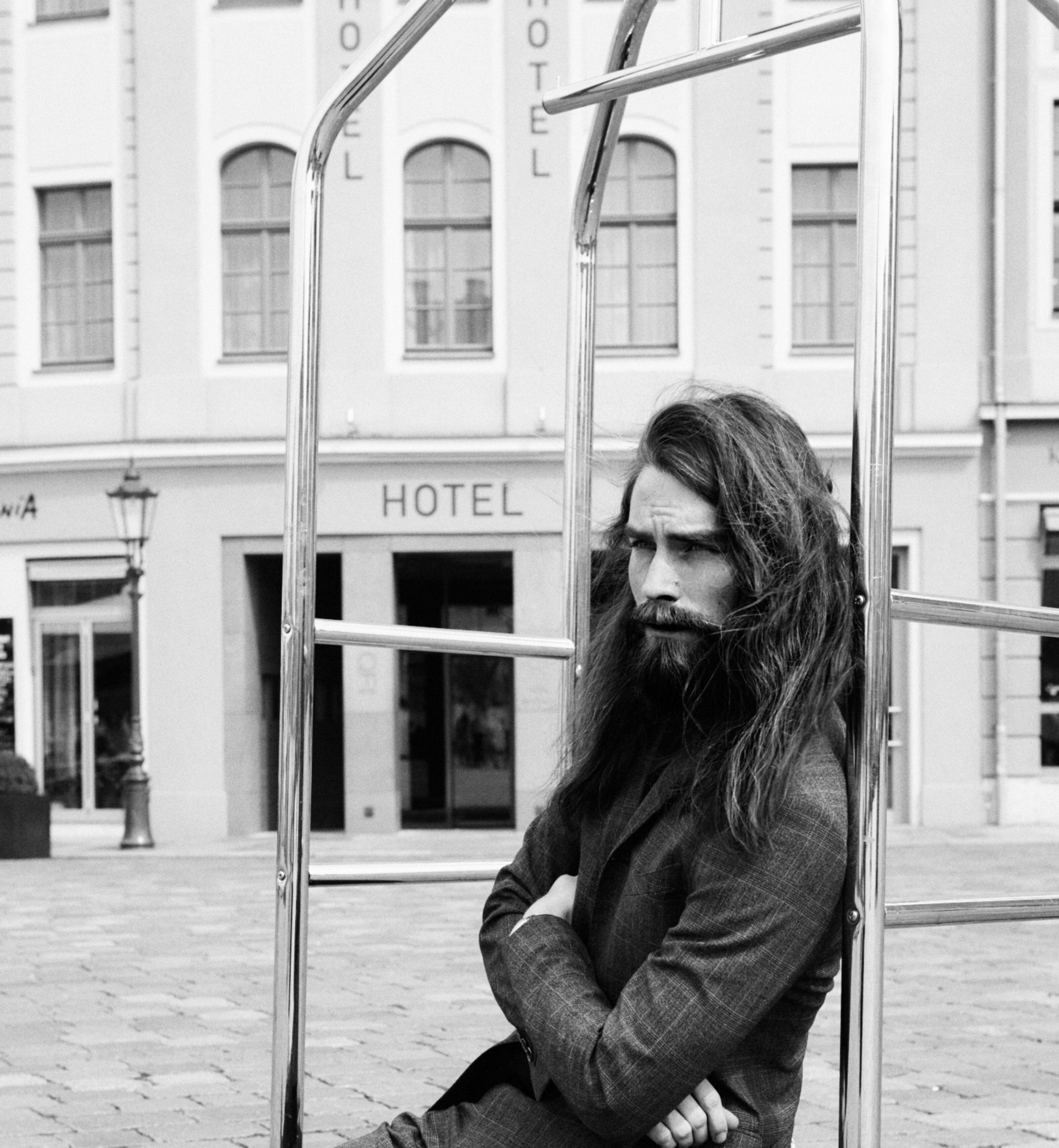
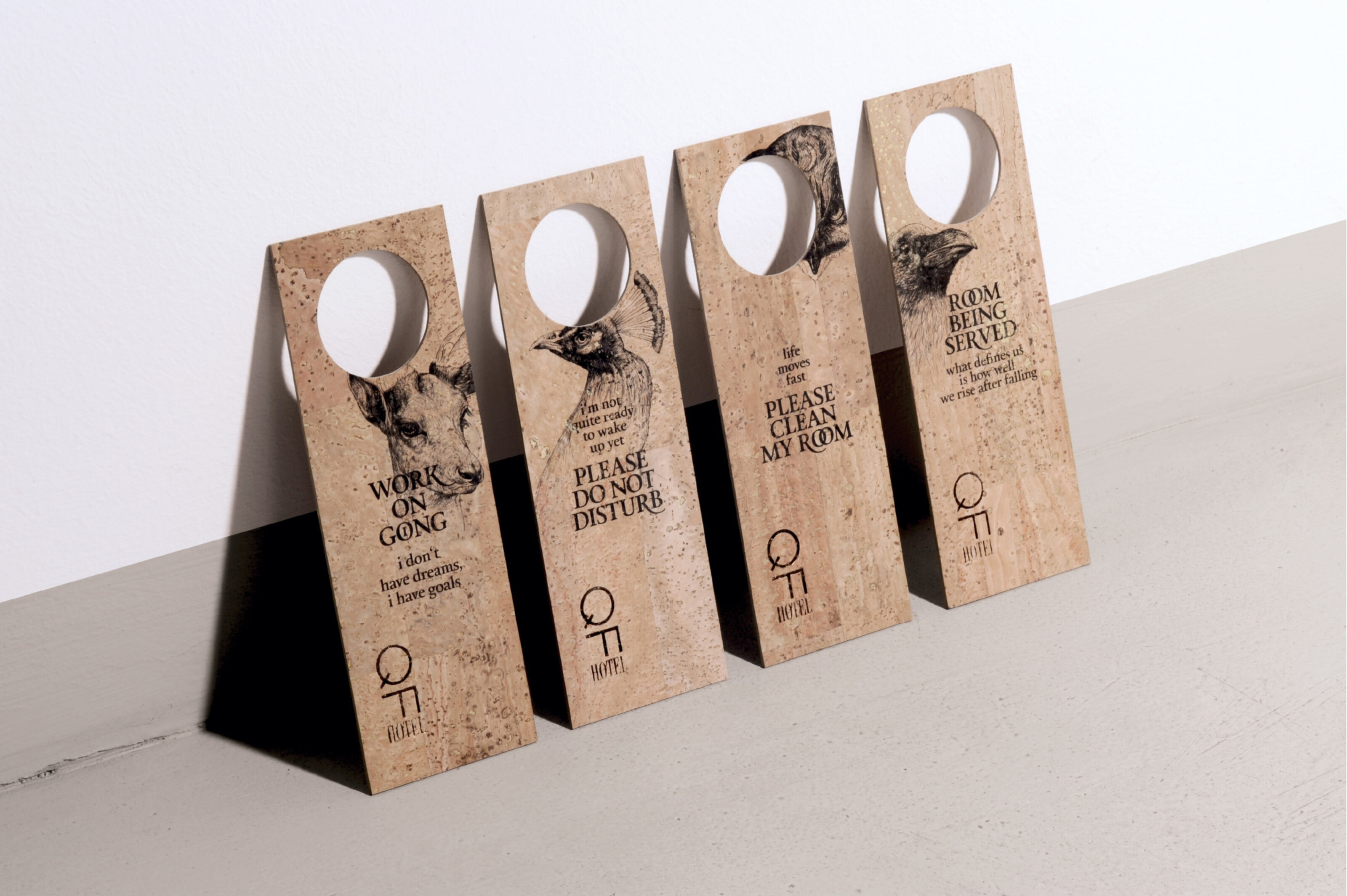
Hotel Stadt Rosenheim
How can the established identity of a space be manifested without regressing into nostalgia?
The core challenge in relaunching the heritage-steeped Hotel Stadt Rosenheim lay in rejecting any form of artificial staging. Rather than fabricating a concept, we uncovered the identity of the landmarked building archaeologically: a historic wallpaper pattern found within the hallway became the design matrix for the entire framework. By systematically tracing this physical fragment across all analog media, the in-house signage, and the digital presence, the building’s history is transformed into a contemporary, tactile substance.
*
*
*


Tanzplattform Deutschland 2020, München
Kontrollierte Dissonanz: Identität im Bruch.
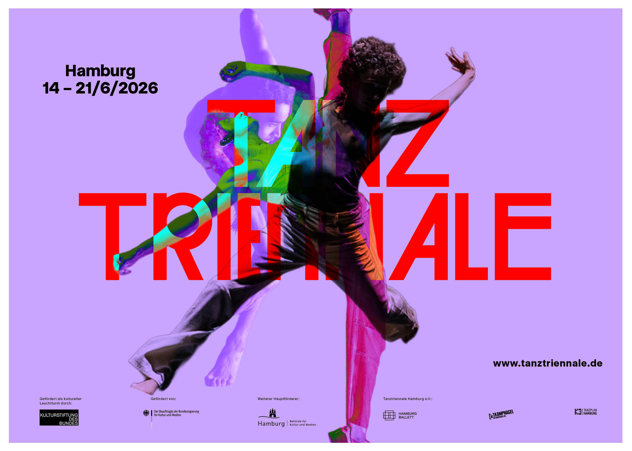
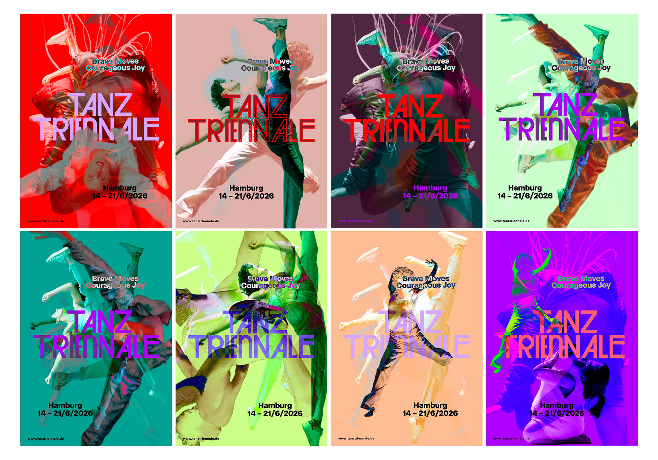
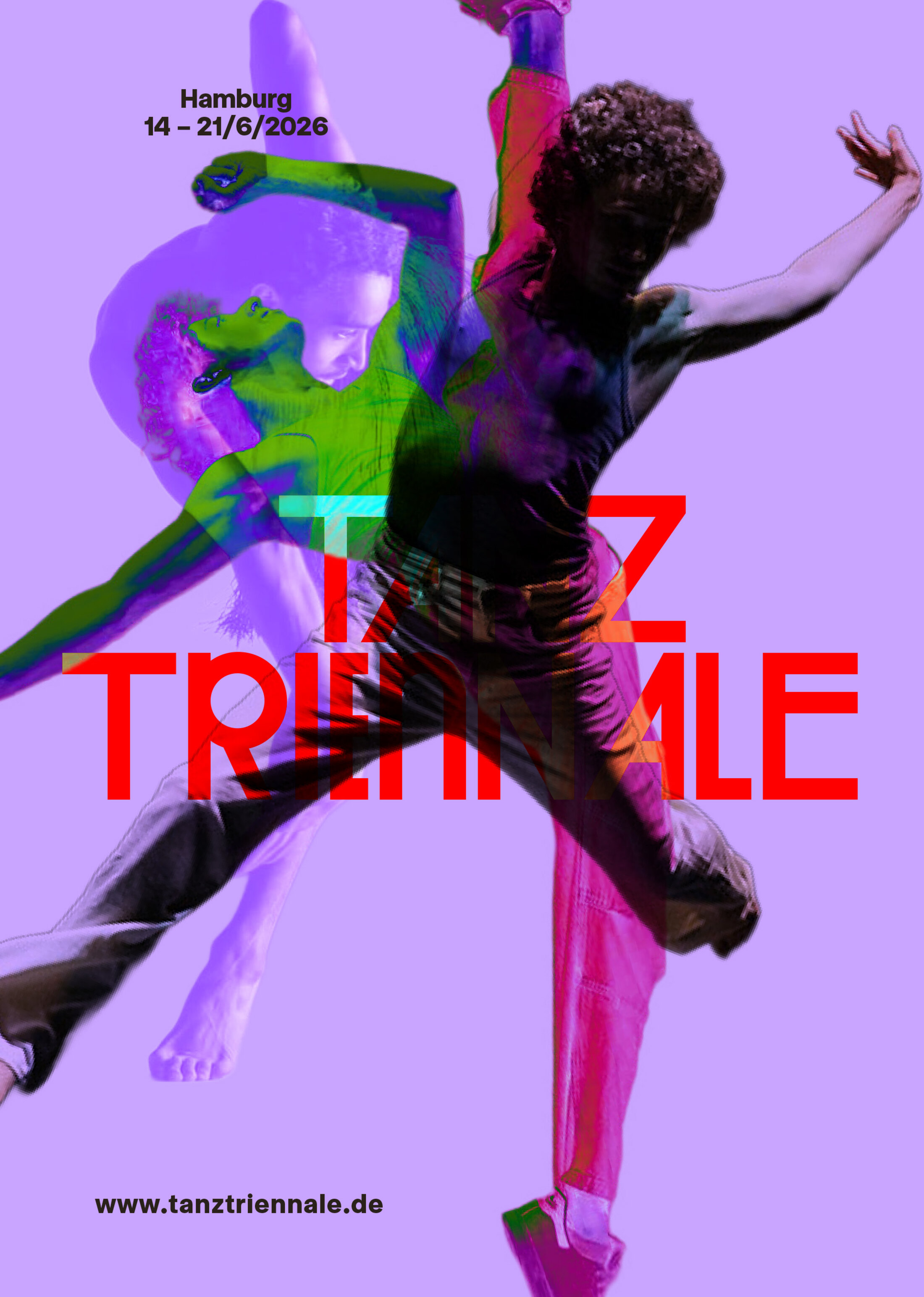
Wenn das wichtigste Festival für zeitgenössischen Tanz nach München kommt, darf das Design nicht glatt sein. Unser visuelles System für die Tanzplattform Deutschland basiert auf verschobenen Welten: Illustrationen ruckeln, Ebenen geraten gegeneinander, Fragmente bleiben unvollständig. Konterkariert durch edle Heißfolienprägung entsteht ein spannungsgeladener Dialog im Printraum, der die physische Radikalität des Tanzes perfekt reflektiert.
*

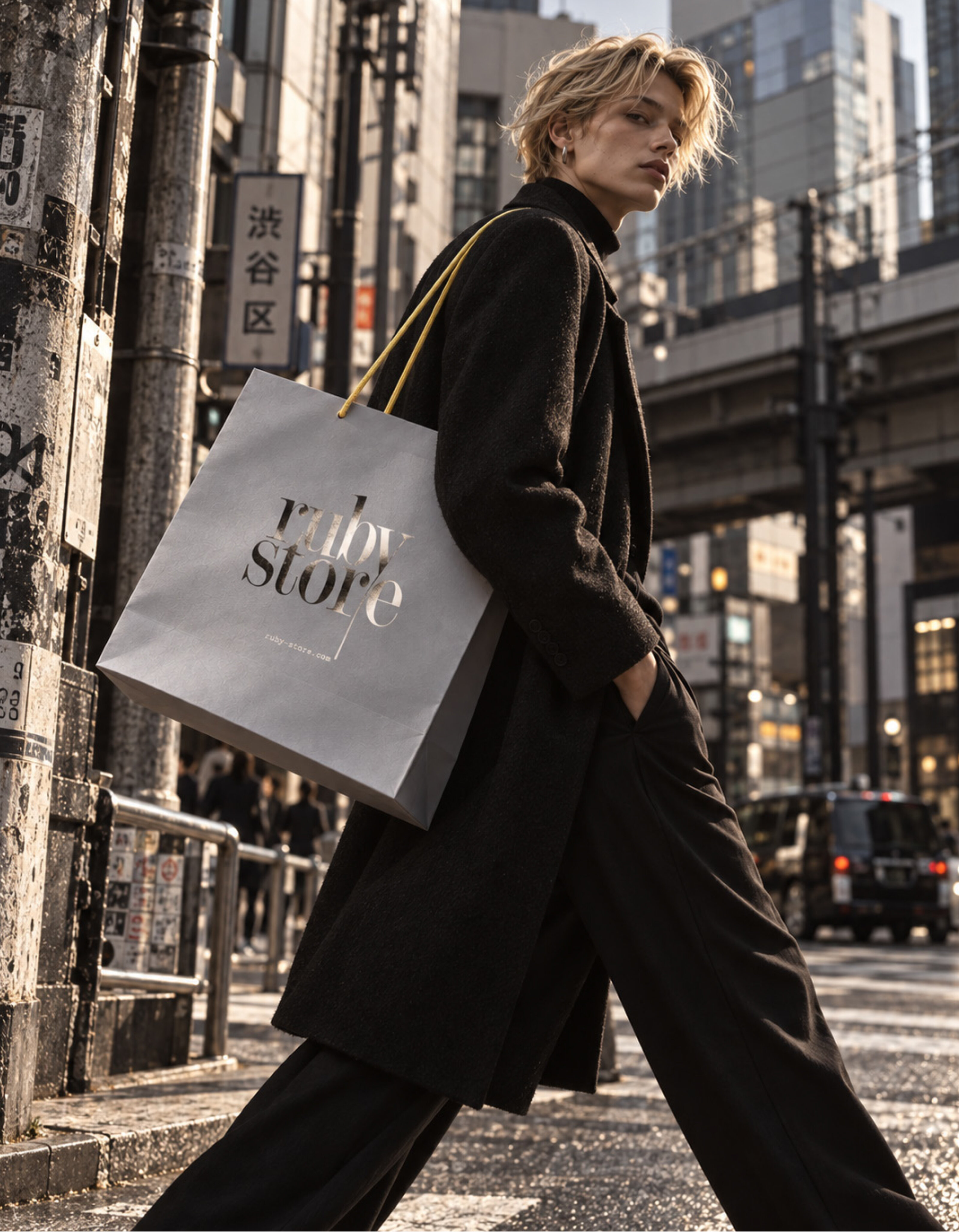
Ruby Store
How does a visual identity bridge global avant-garde with local heritage?
The Ruby Store in Munich’s Gärtnerplatz district is renowned for its highly curated selection of international designer labels. The brand design we developed mirrors the core of this textile curation: it breaks away from conventional retail stereotypes, relying instead on an uncompromisingly clean identity system. The reduced visual framework allows the progressive silhouettes and textile textures the perfect space to unfold, anchoring the store as a distinct, creative constant within the urban landscape.
*
The beginning of a collaboration
It all begins with the conceptual origin.
Uncovering the essence of a project together and building a new foundation.