Signage Design
We design wayfinding systems, façade signage and spatial communication in dialogue with architecture and design.
*
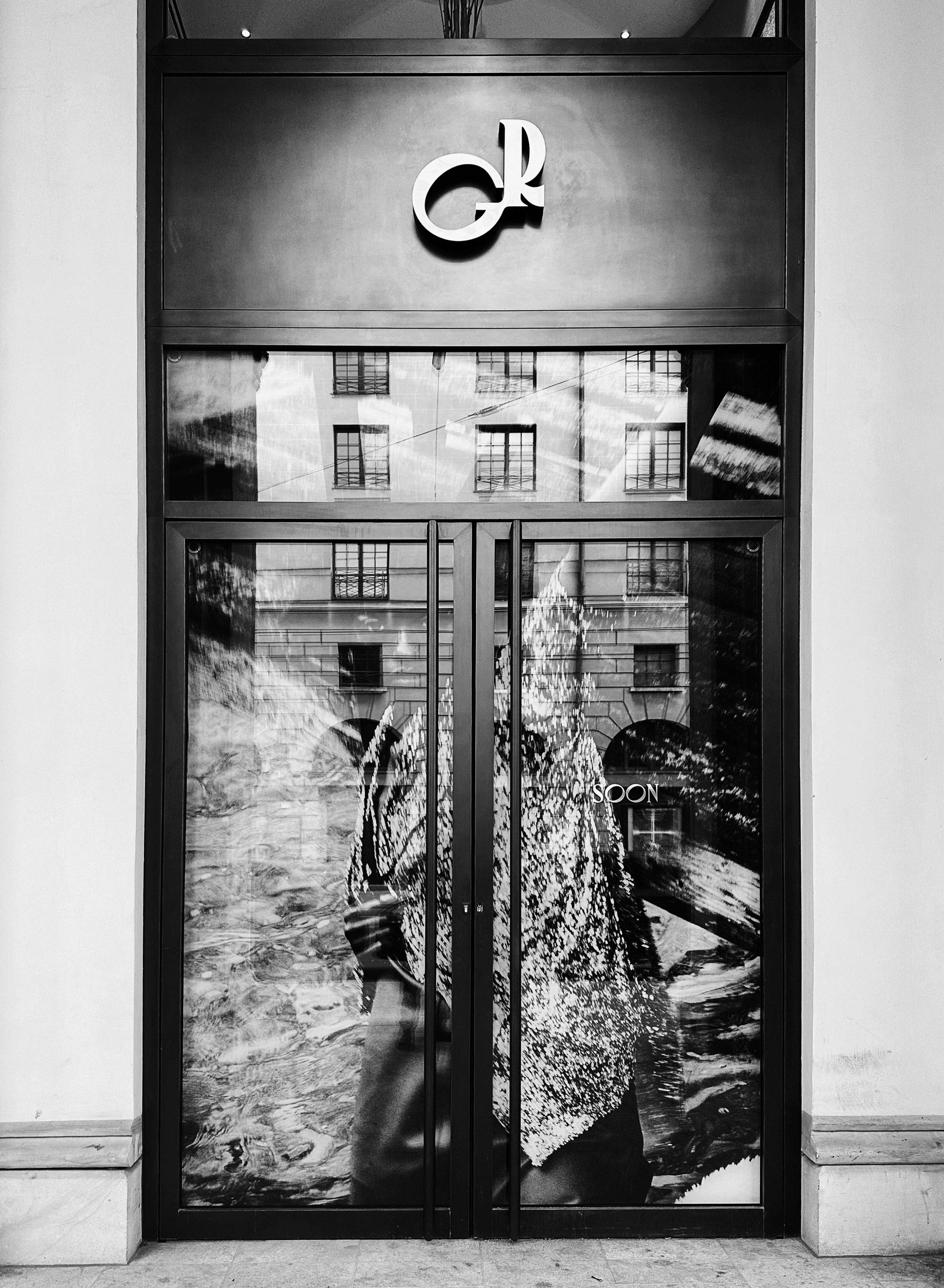
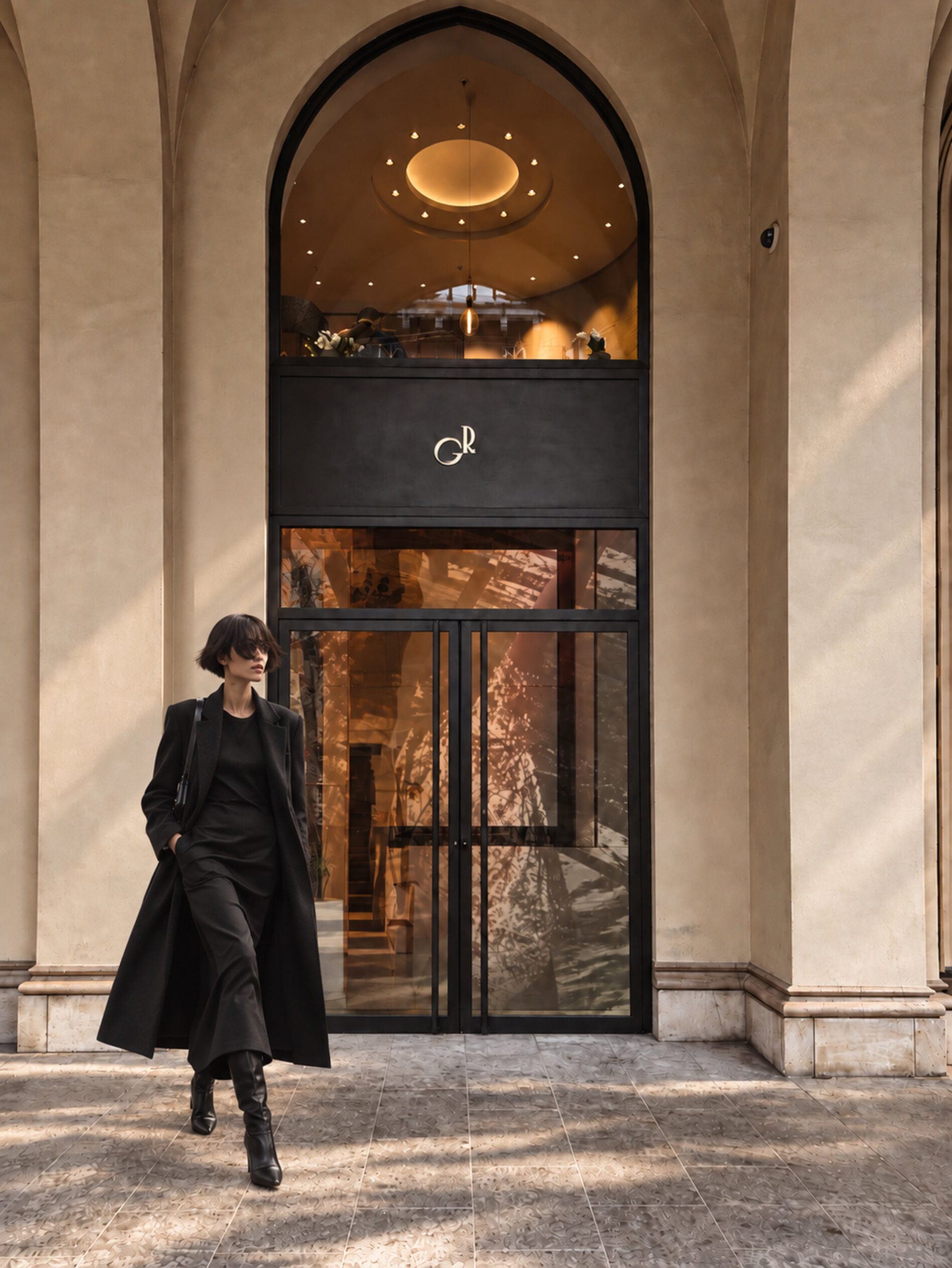
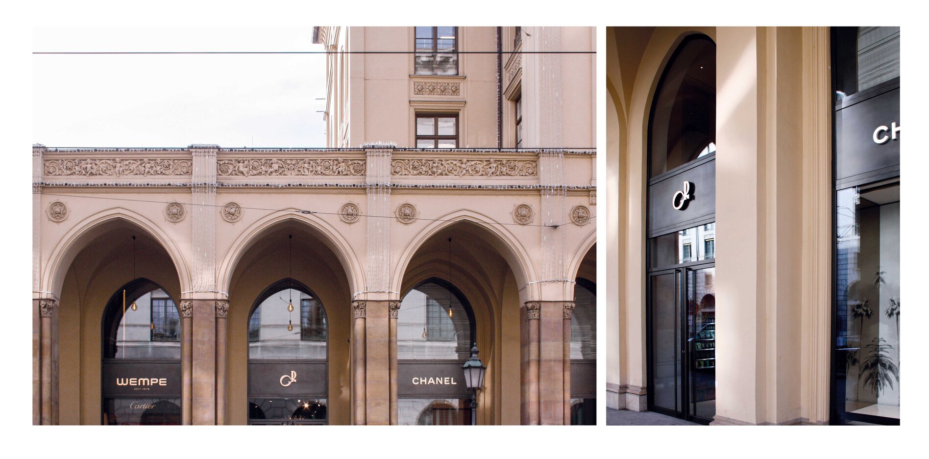
Giulia & Romeo
For Giulia & Romeo, we have repeatedly translated the visual identity into the urban space. On large-scale posters, the brand’s distinctive visual language takes on a different dimension: strong imagery, bold typography and large areas of colour meet façades, streets and the visual noise of the city.
The posters are designed to work from a distance. At this scale, individual details suddenly become dominant, typography turns into image and motifs change their effect. It is within this urban context that the particular character of Giulia & Romeo becomes most visible – direct, self-assured and with a visual presence that holds its own among architecture, traffic and everything else competing for attention.
*



Lico Solutions
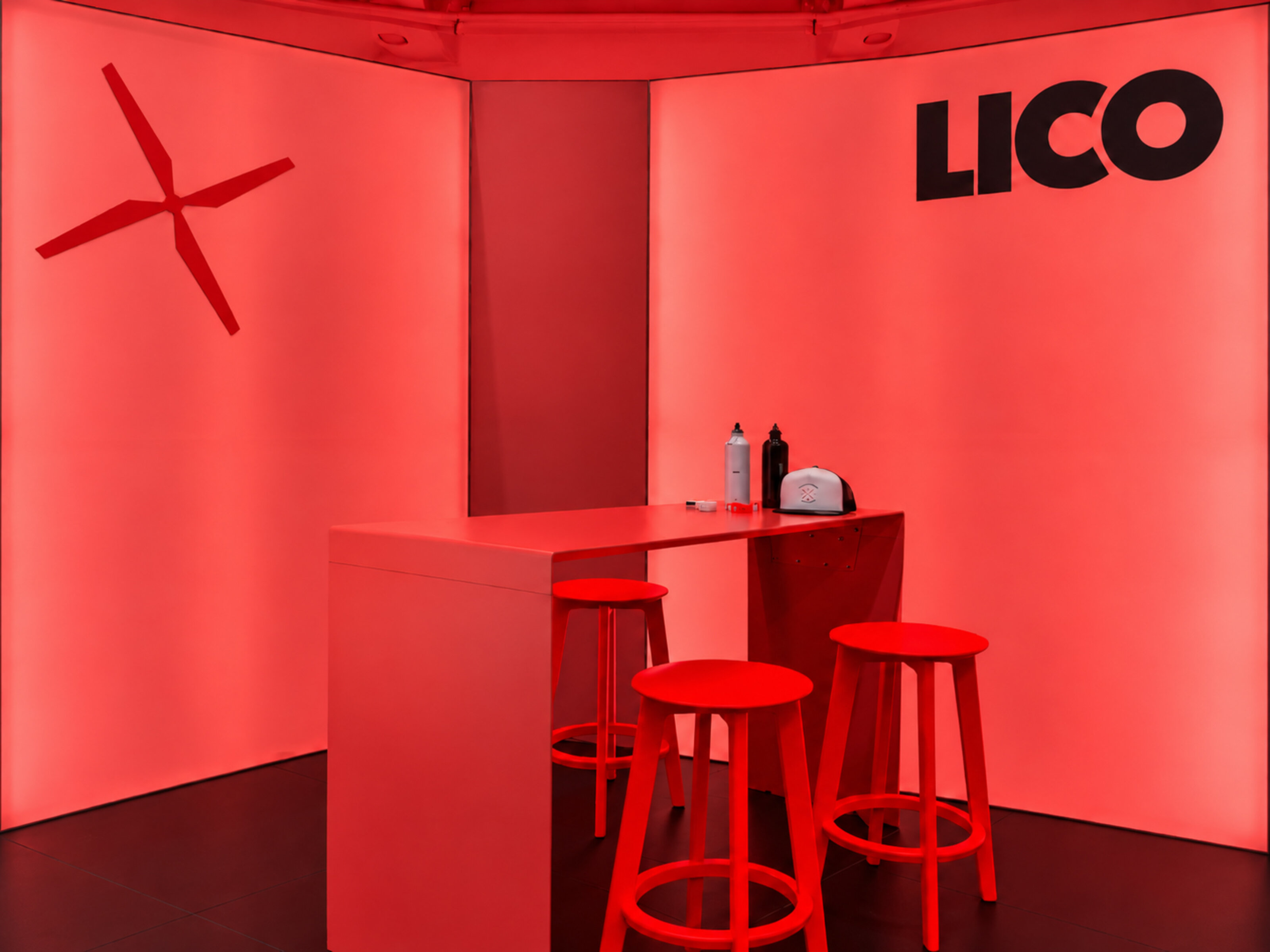
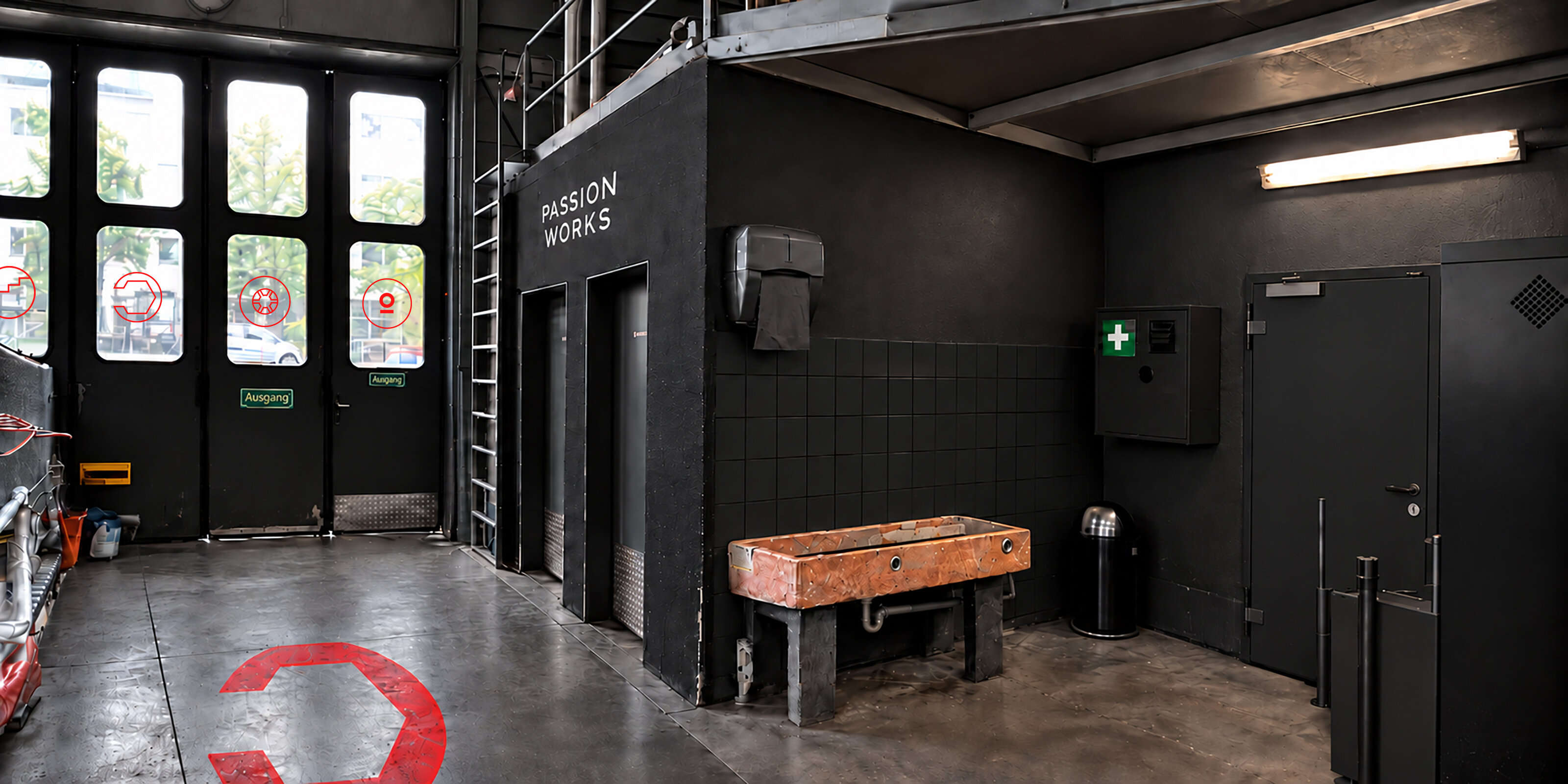
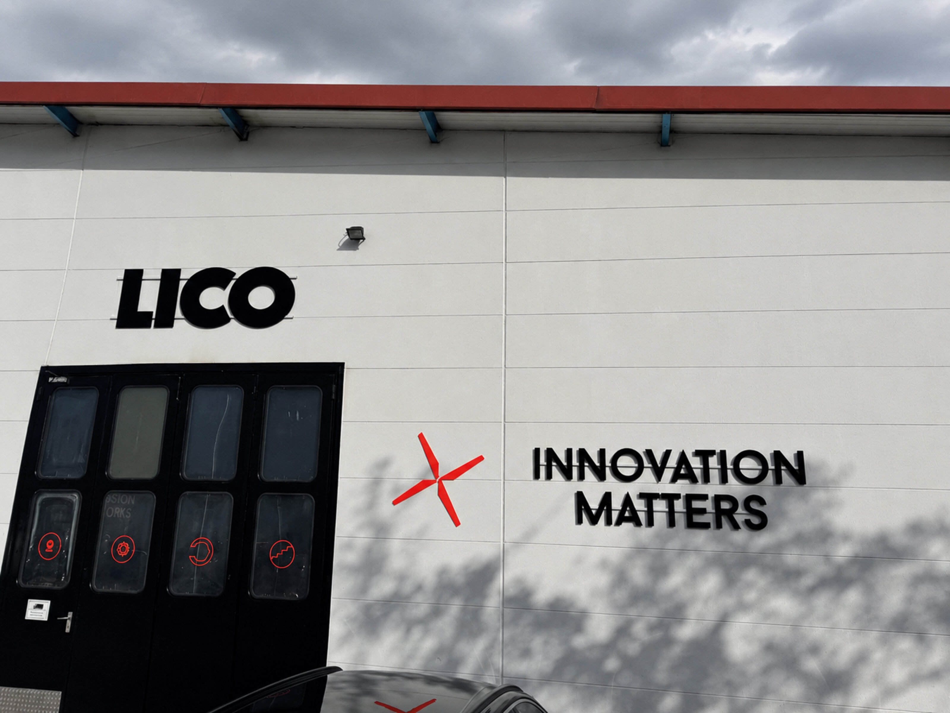
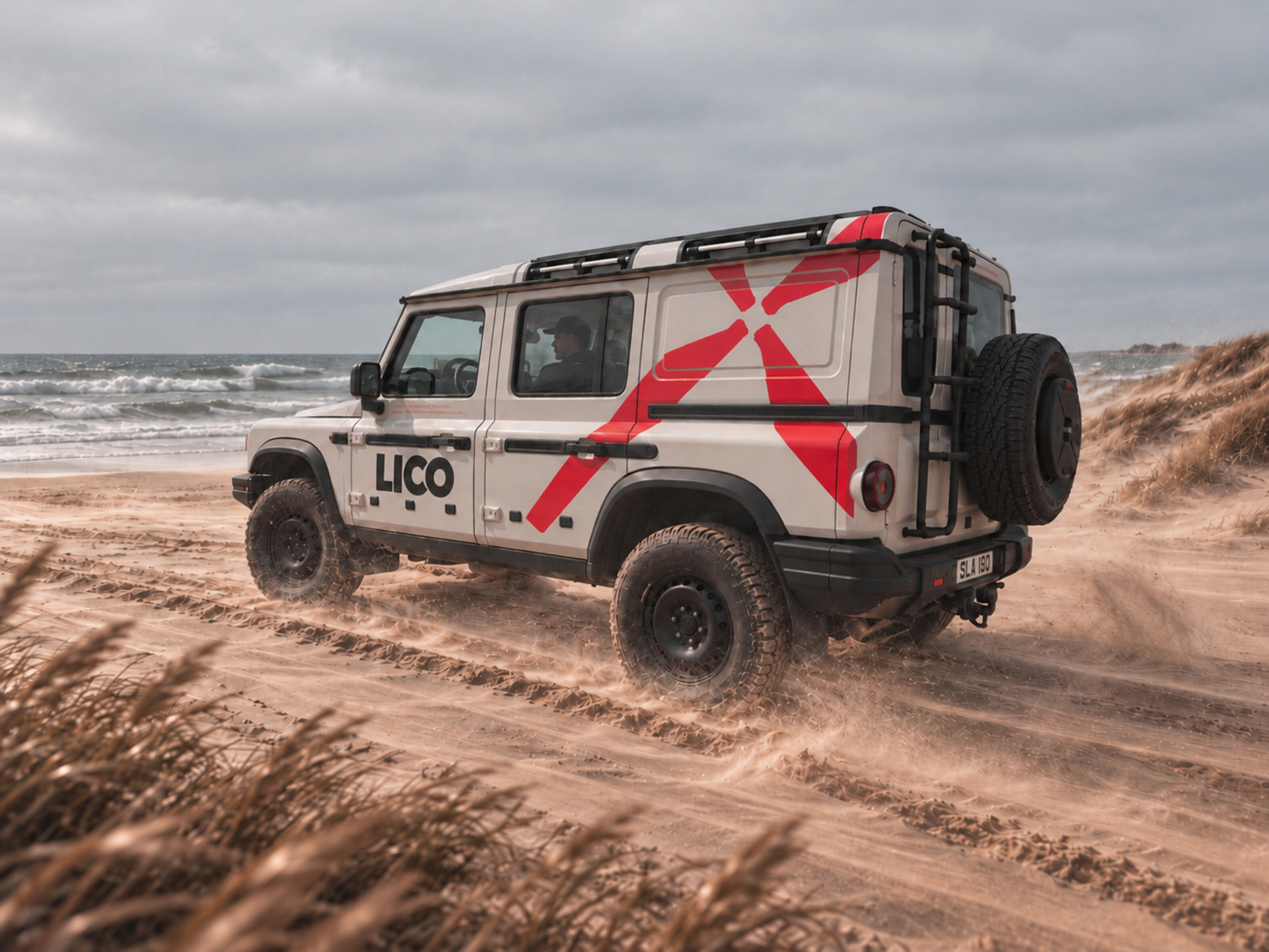
Für LICO haben wir die visuelle Identität in den Raum übertragen. Das neonrote Rotorblatt wird zum dreidimensionalen Zeichen an der Gebäudefassade, zieht sich in großen Dimensionen über Fahrzeuge und findet auf internationalen Messeständen seinen Platz in der Architektur.
Hier spielen Licht, Farbe und Raum zusammen. Leuchtende korallfarbene Wände treffen auf schwarze Typografie und eigens entwickelte Interior-Objekte, die wir gemeinsam mit Formstelle entworfen haben. So entsteht eine räumliche Fortsetzung des Corporate Designs, in der selbst Möbel und Licht Teil der grafischen Sprache werden.
Von der Fassade bis zum Messestand bewegt sich das Erscheinungsbild durch unterschiedliche Räume und Maßstäbe.
*


Max Joseph Tattoo
Max Joseph is a tattoo studio in Munich’s Glockenbach neighbourhood. We developed a monogram from the initials of the name, with a form that also draws on the ornamentation of classic tattoo imagery.
Across the façade, it appears in different ways: as a sign above the entrance, on the awning and directly on the glass. Black and white, ornament, typography and the existing architecture come together to give the studio a presence closer to a small, particular shop than to the usual visual language of a tattoo studio.
*


Friedrichskrone
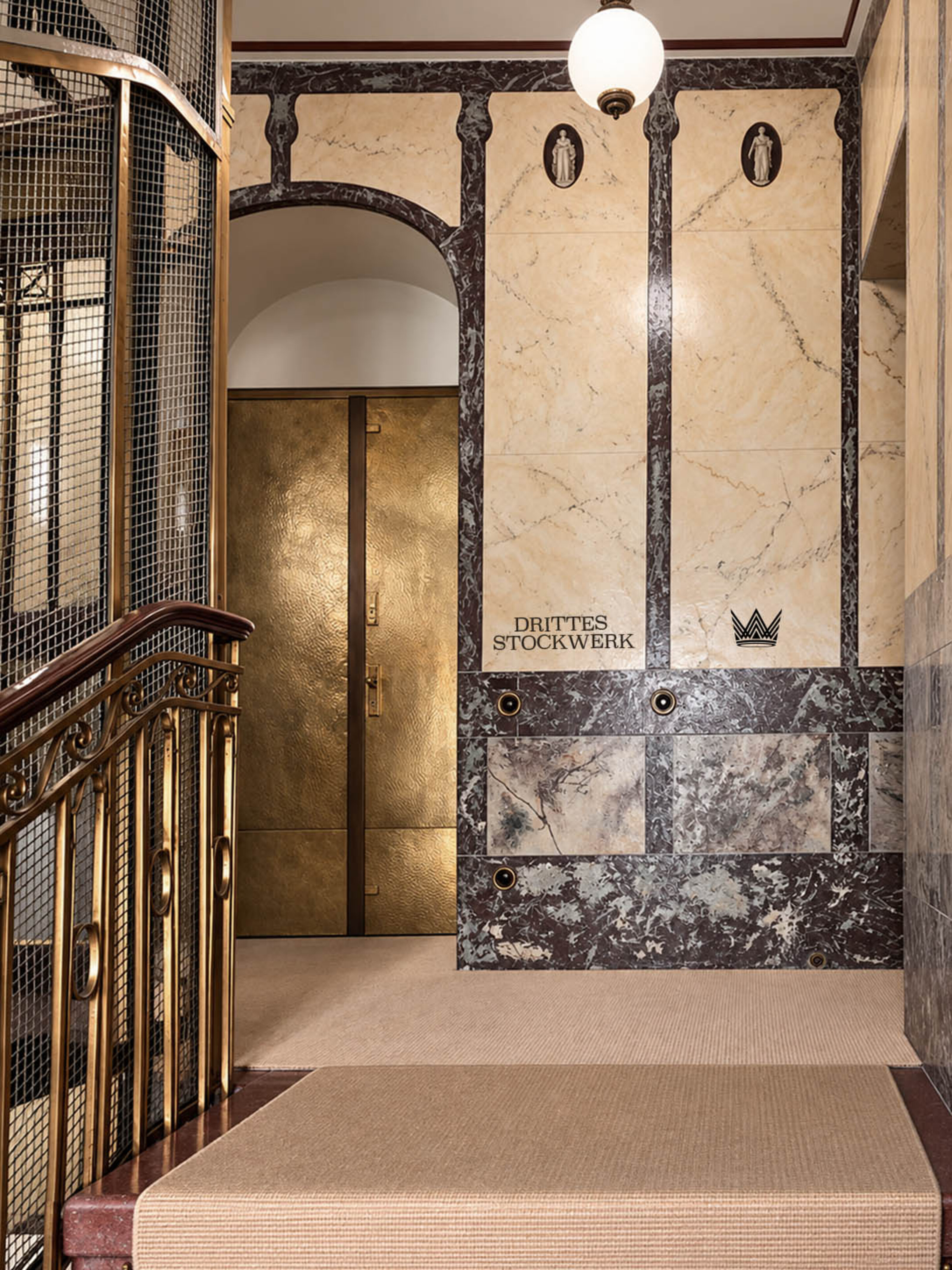
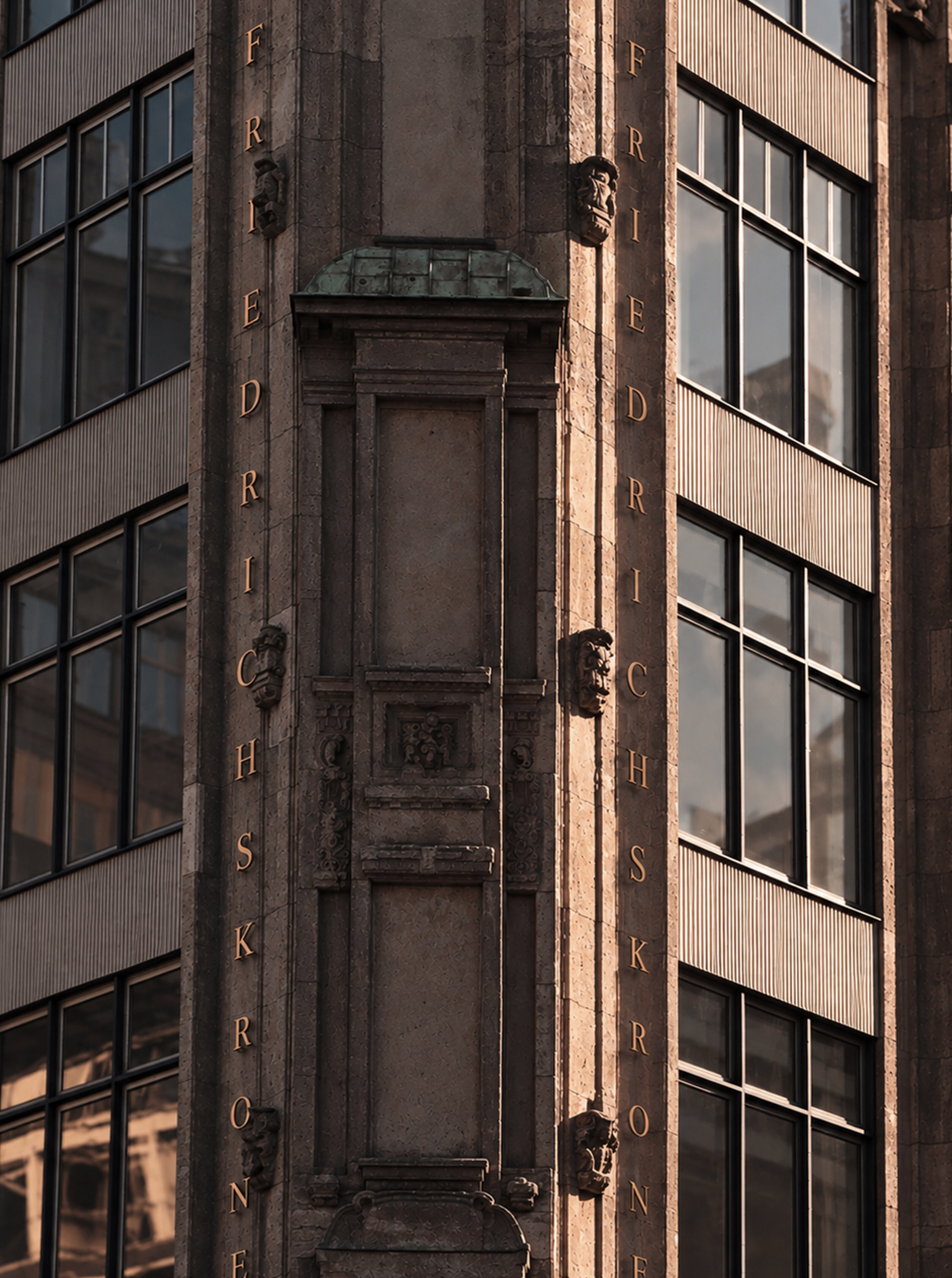
A Belle Époque building on the corner of Friedrichstrasse and Kronenstrasse is being transformed into a contemporary office building, with its historic elements remaining part of the architecture – and becoming the starting point for our design.
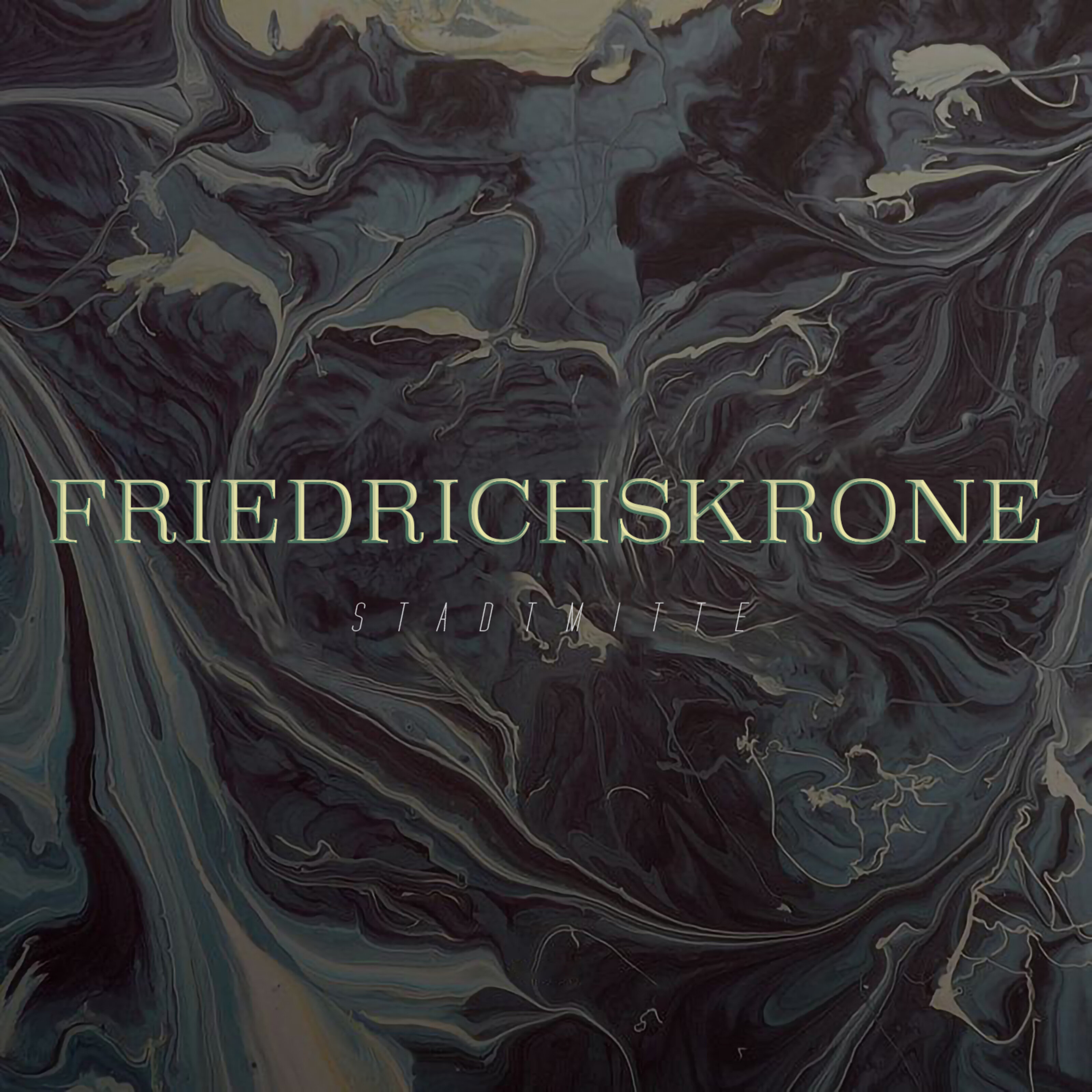
The name was already there, hidden in the intersection: Friedrichskrone. We developed a visual identity that works with what the building already brings with it. The historic crown on the façade is finished in gold and reappears as a motif throughout the logo and signage. Typography, graphics and wayfinding pick up on forms and details of the building and bring them into the present.
Old and new sit quite close together here. The identity grew from exactly that.
*


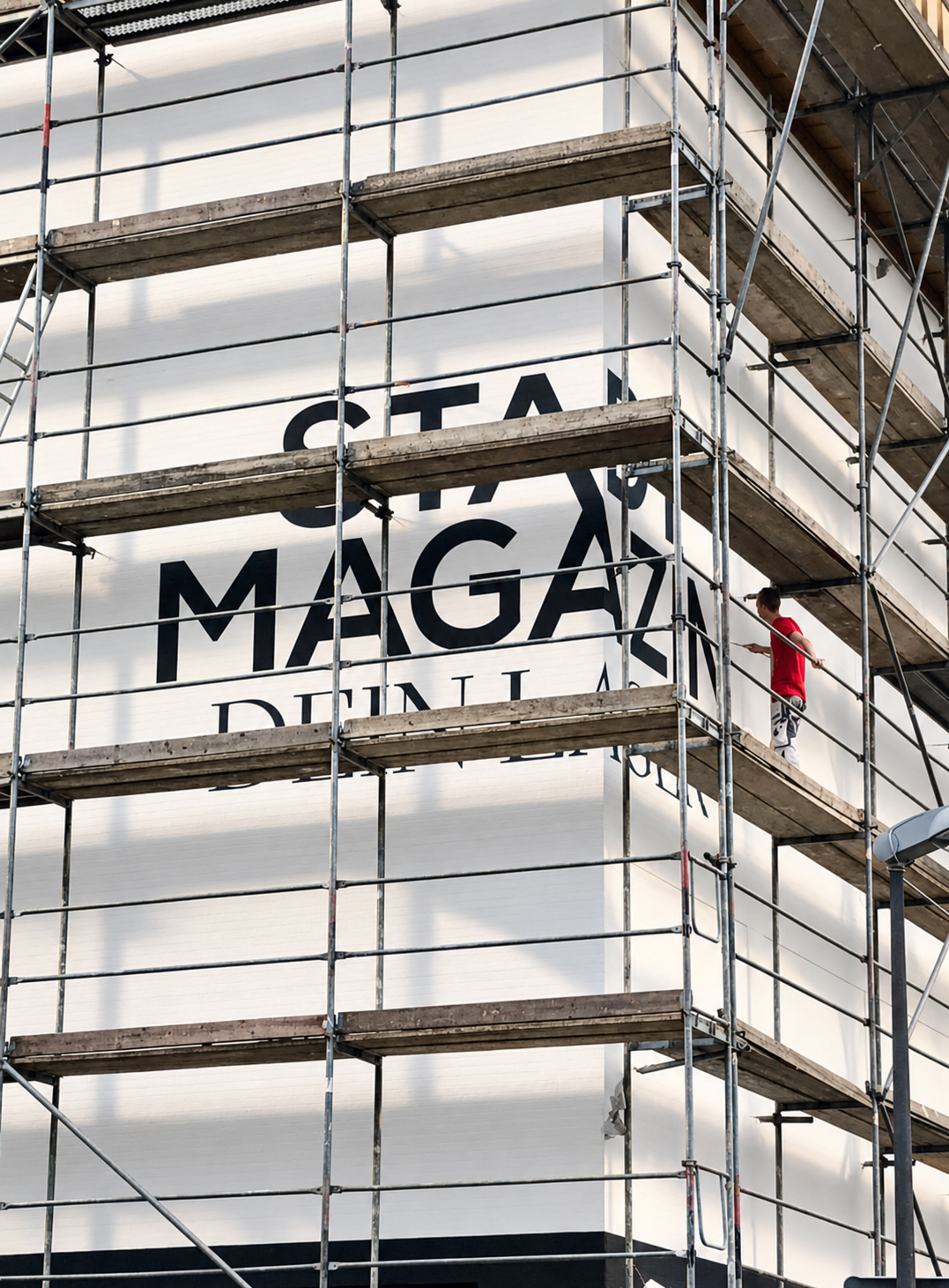
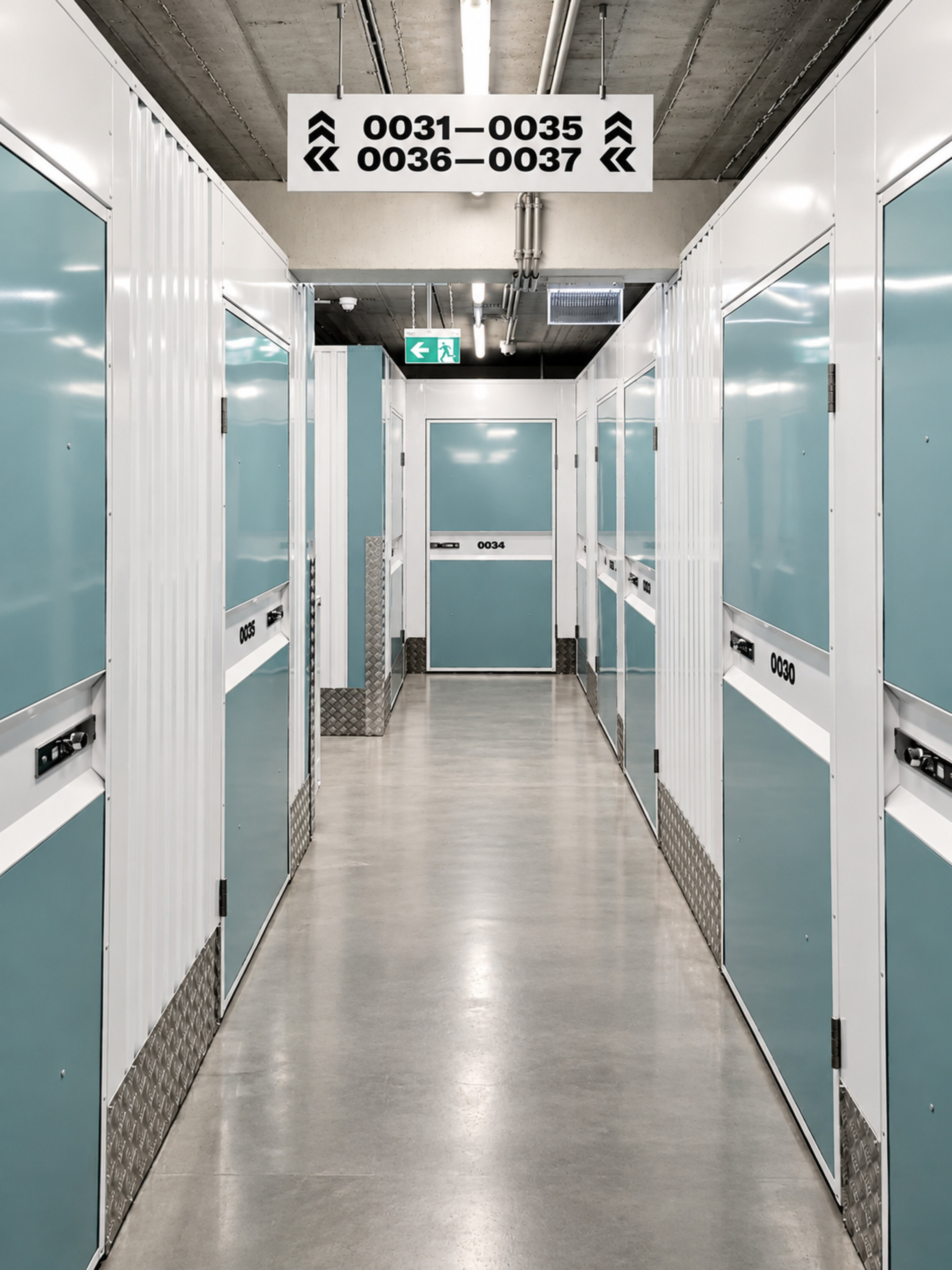
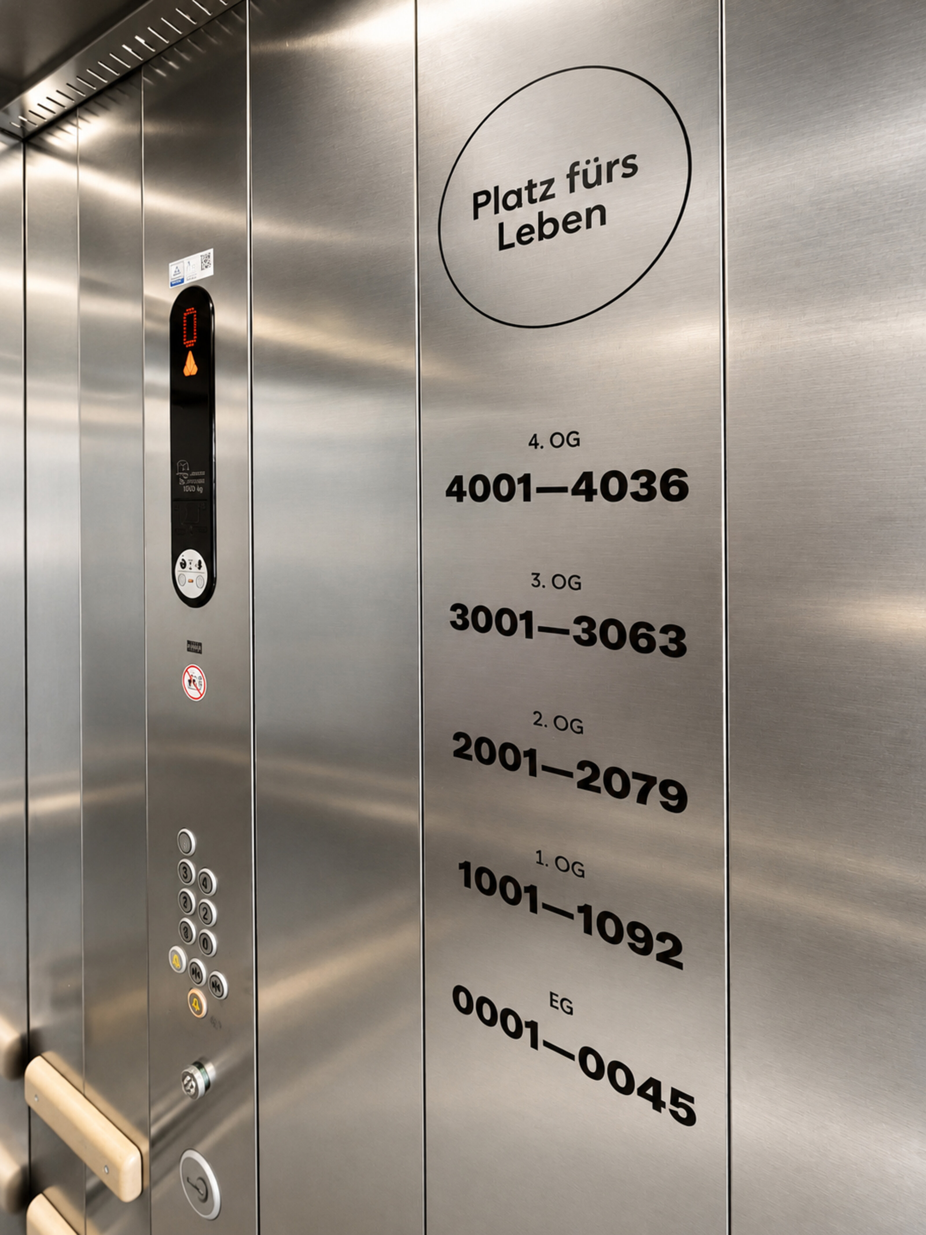
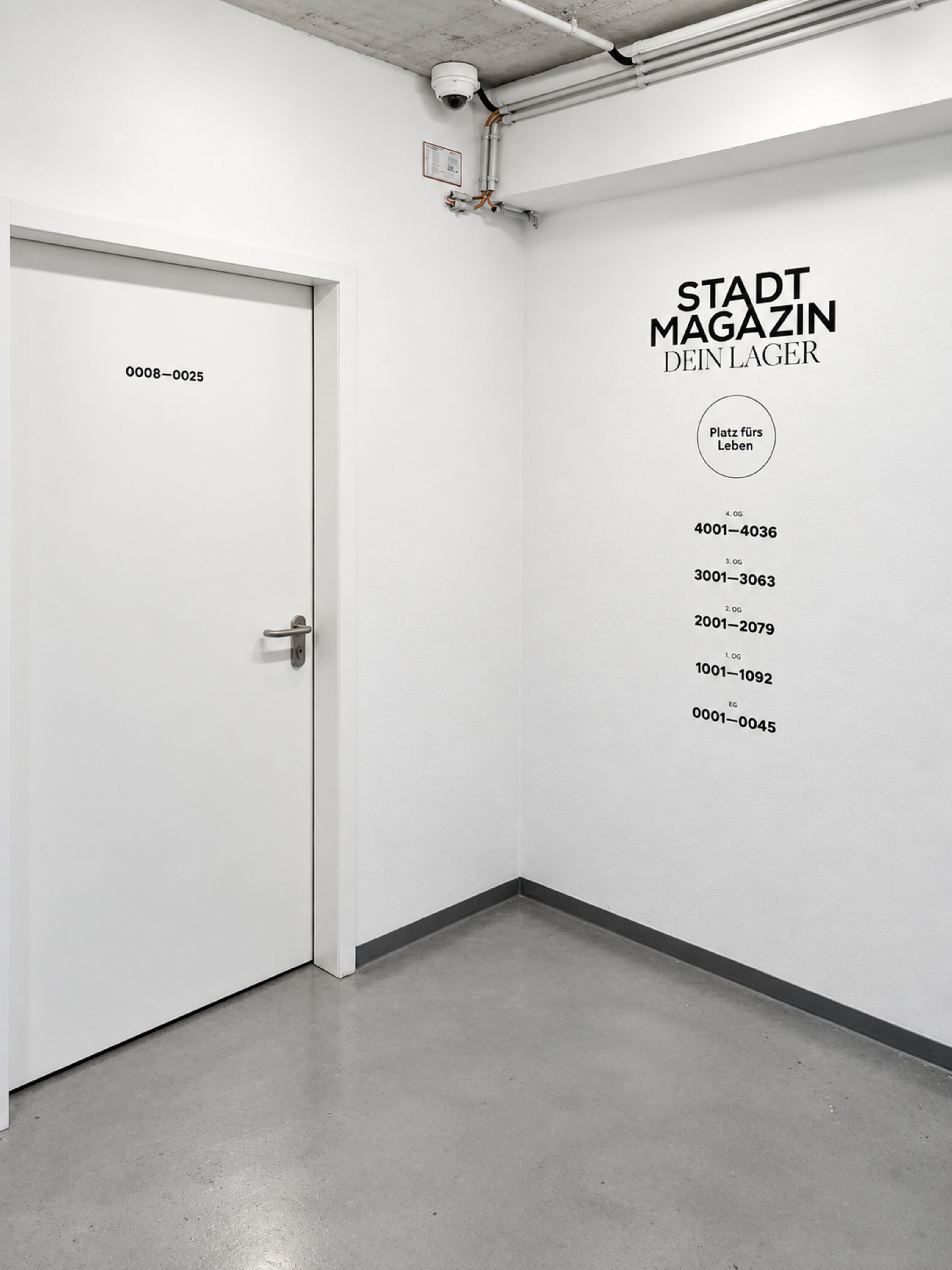
Stadtmagazin
Kante Bar
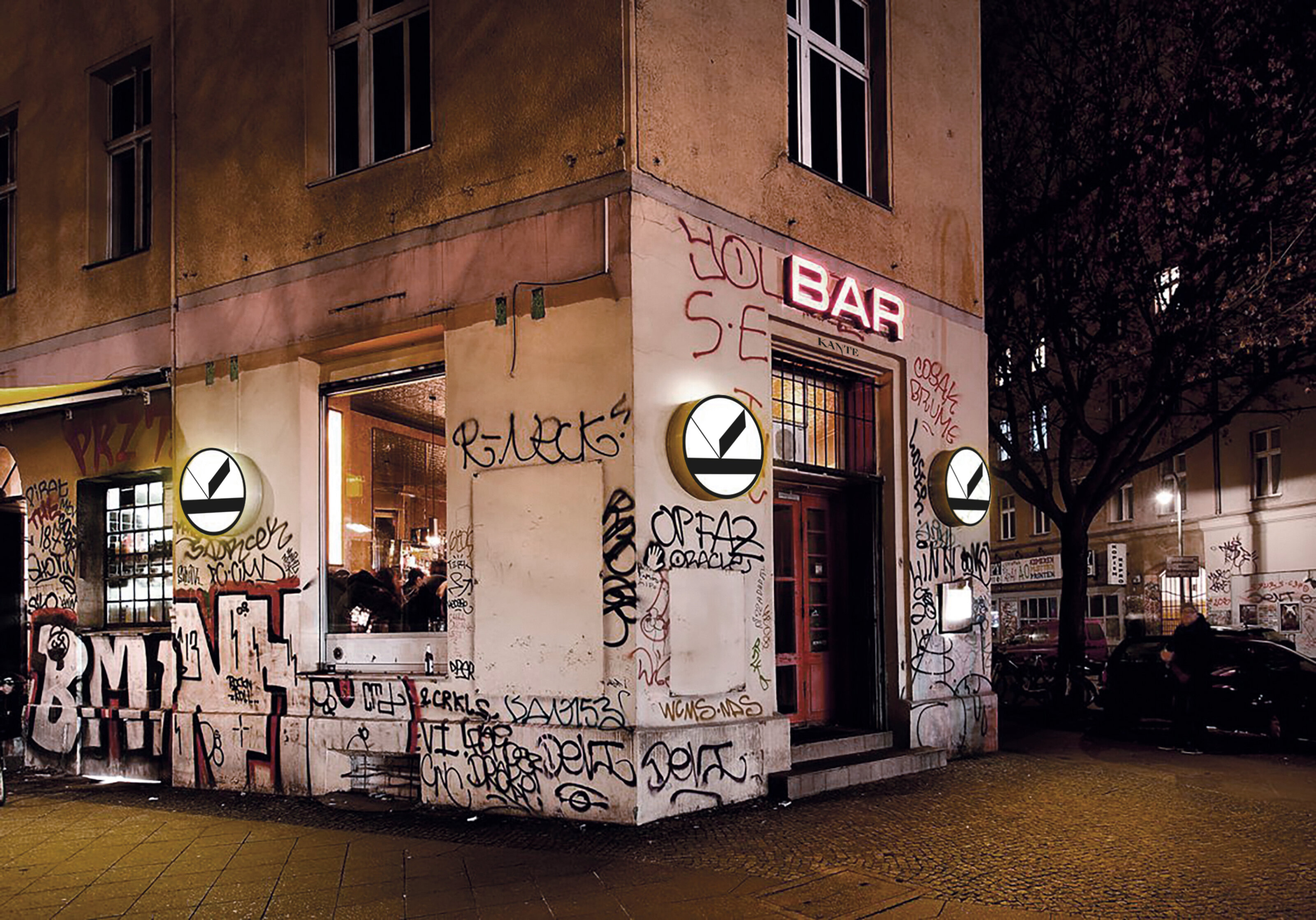
Kante Bar sits right in the middle of Berlin and was meant to stay exactly there. The traces of the city, the graffiti and the raw façade became part of its identity rather than disappearing behind a new surface.
We developed a reduced geometric symbol that appears outside as an illuminated sign and quietly repeats itself throughout the interior. On the awning, it becomes KANTE – sharp, narrow and slightly peculiar.
Inside, things get darker and quieter: raw walls, leather, individual lights and the symbol appearing again throughout the space. An identity that doesn’t decorate the place so much as become part of what was already there.
*



Alte Post, Neukölln
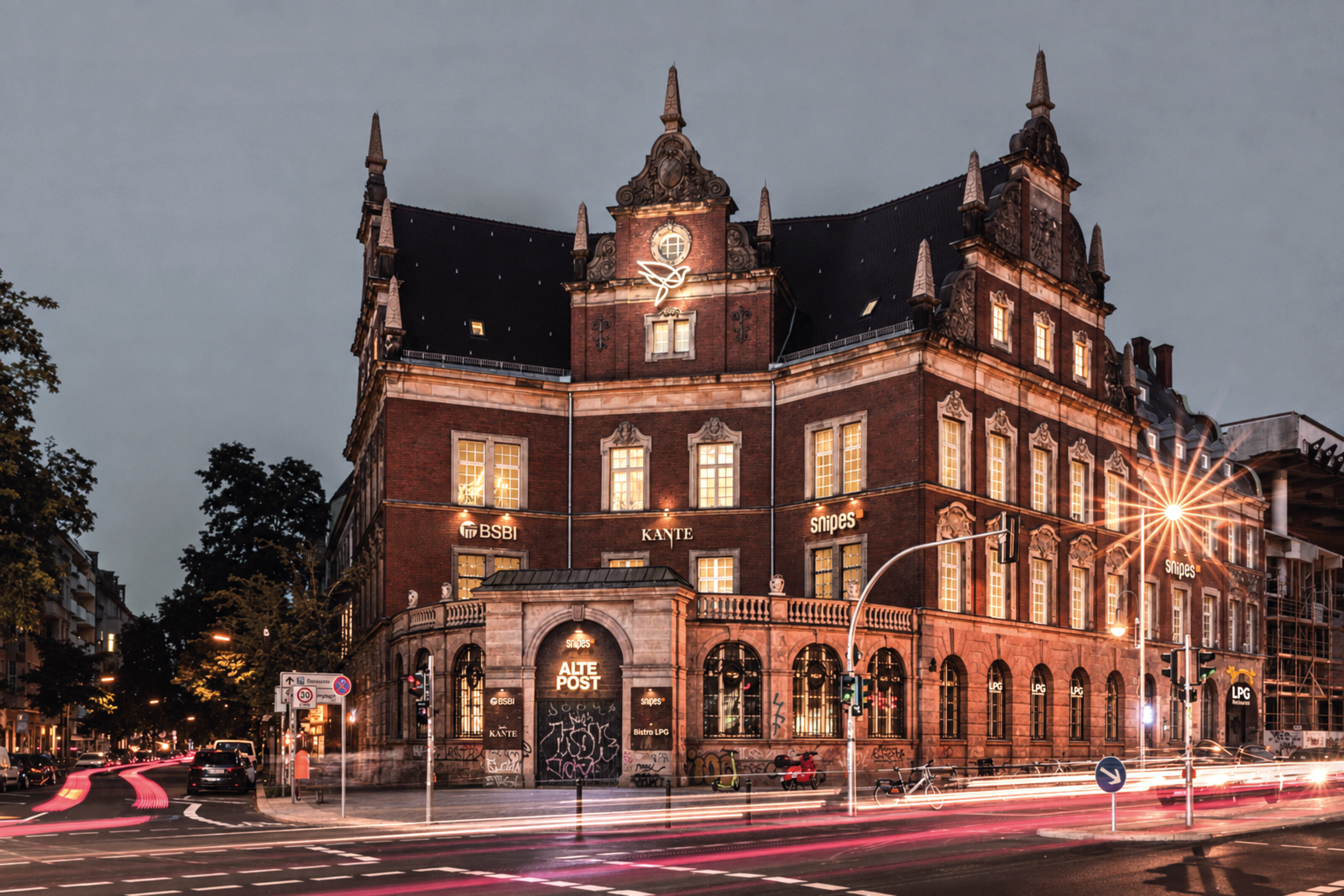
Alte Post is one of those buildings that feels as if it has always been part of Neukölln. The former Imperial Post Office on Karl-Marx-Strasse was restored and transformed into a new place for offices, retail and gastronomy.
For its new identity, we drew a dove of peace. One continuous line that became the symbol of the building and today shines high above the historic façade.
Originally, illuminated signage wasn’t permitted at this height. The building is listed, and every intervention in the façade had to be carefully coordinated. In the end, the dove became part of the building – a sign visible from far across Neukölln.
We also accompanied the building throughout its transformation. Alte Post, neues Leben – old post, new life: large-scale imagery and typography appeared across the still raw, unfinished spaces while something new was already taking shape behind them.
*

Forum Steglitz
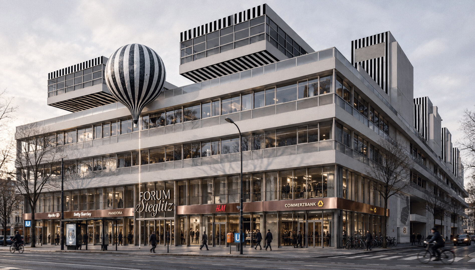
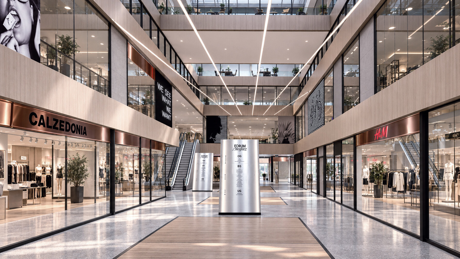
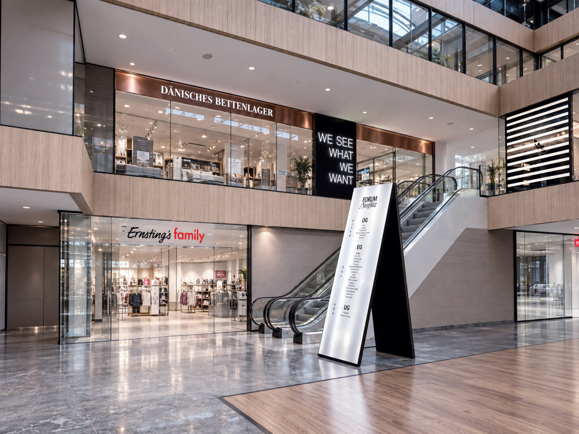
For Forum Steglitz, we developed a new visual world somewhere between Berlin and Paris, department store and circus.
Black and white stripes run through the architecture, across illuminated panels and elements of the façade. A giant balloon floats above it all. Inside, imagery, typography and light appear between the different levels – slightly surreal, slightly elegant, with the particular magic of an old Parisian circus.
The concept was developed as part of the planned transformation of Forum Steglitz. Then the operator changed, and so did the plans for the building. What remains is a vision of a shopping centre that, for a moment, could have been something else.
*
Herz Bar
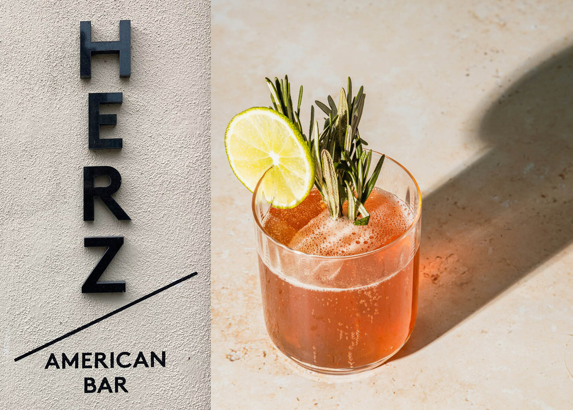
Herz Bar in Dresden is an American bar with a pretty clear idea of what belongs in a glass. Very good drinks, small plates and plenty of marble.
For the visual identity, we played with the name and reduced the heart to its simplest form: two lines, one angle, almost a sign. The typography is equally direct, appearing across the façade, menus and throughout the space.
A bar for long evenings, short drinks and everything in between.
*

*


Elisenhof, München
For Elisenhof in Munich, we developed a new visual identity that works directly with the building. The name becomes the sign itself: ELISEN HOF, set on two levels, compact and almost architectural.
The logo appears large on the façade and returns throughout the building as part of the orientation system. Typography, signage and communication were conceived as one system running through the entire Elisenhof.
The concept was developed as part of a planned repositioning. When the operator changed, the project continued in a different direction – our version of Elisenhof remained a concept.
*




QF Hotel
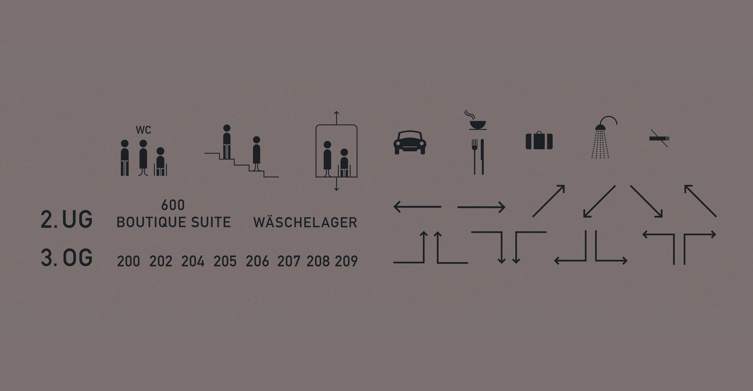
For QF Hotel, we developed the complete wayfinding system – from room numbers and orientation throughout the building to the small signs encountered along the way.
Numbers and typography sit directly on walls, doors and surfaces, becoming part of the architecture. Black, white, brass and light set the direction. Everything is reduced, sometimes almost hidden – and exactly where you need it.
A wayfinding system that leads you through the hotel while keeping rather quiet.
*

Alte Börse, München
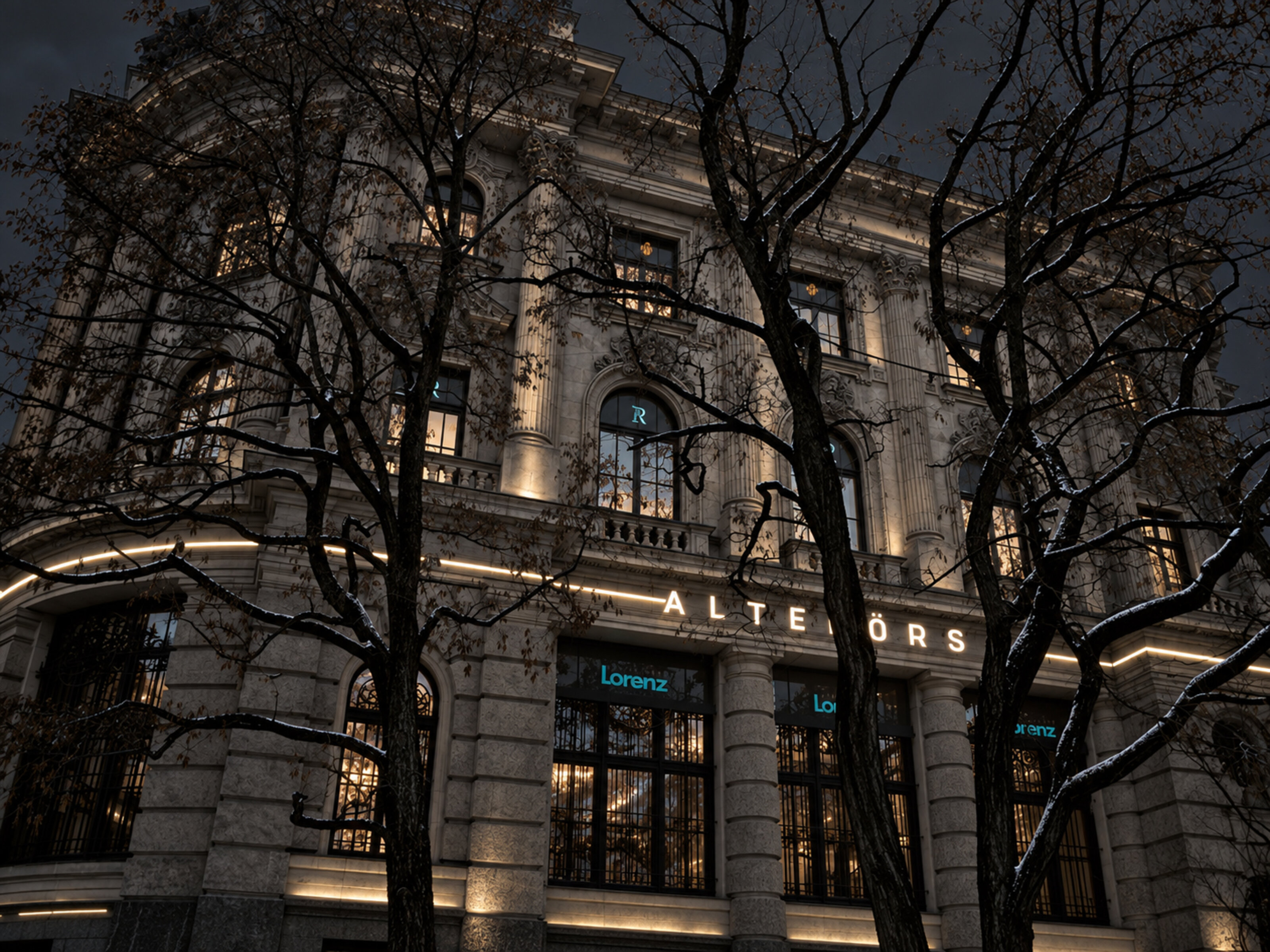
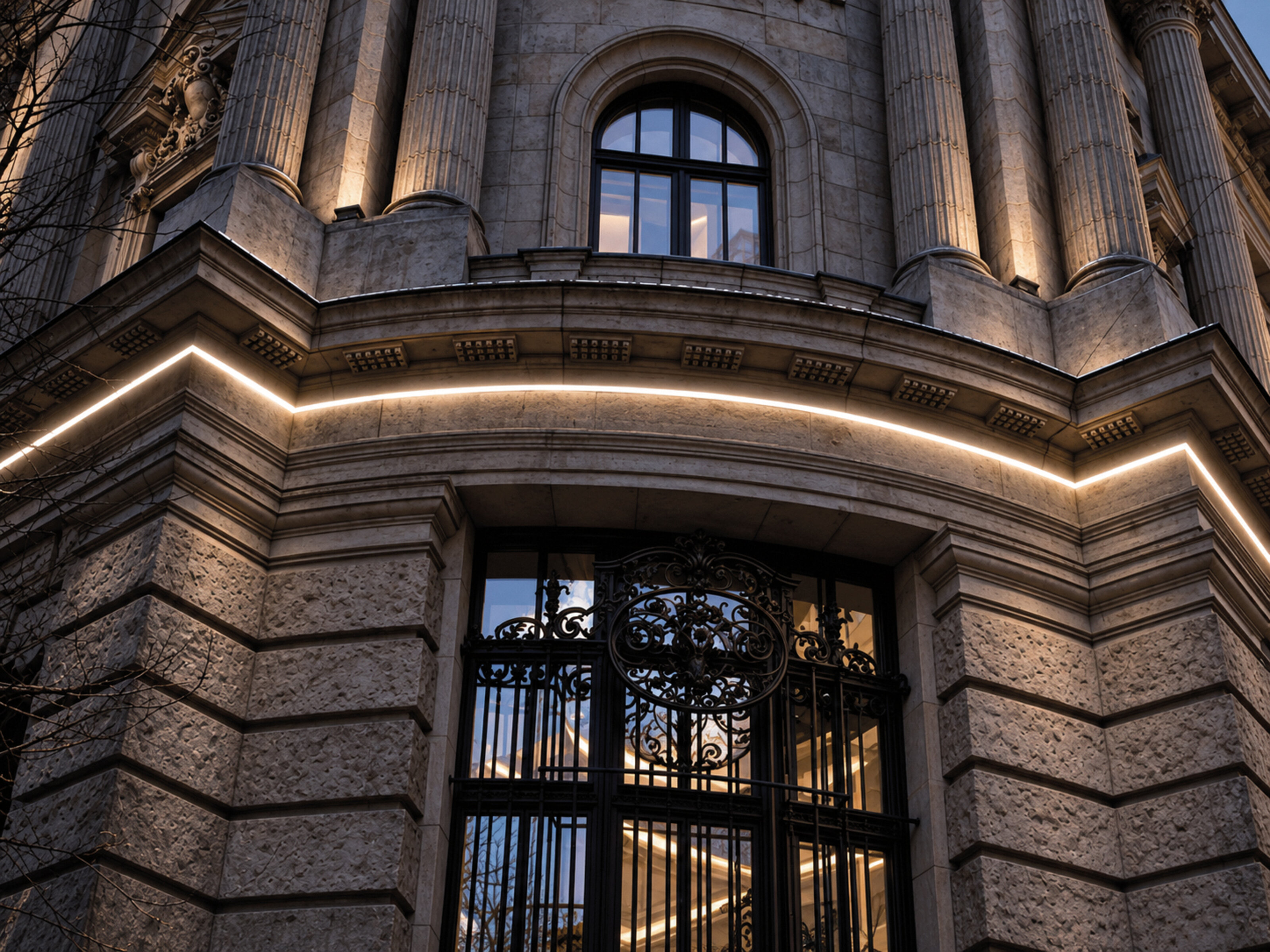
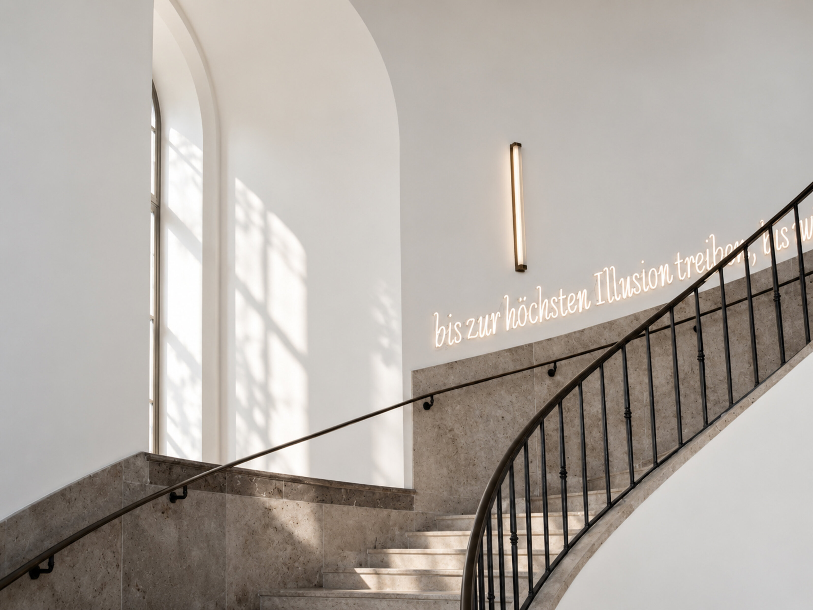
For Alte Börse in Munich, we developed a new visual identity and signage system. The building itself was the starting point – its historic façade, ornamentation, dark metal and the rather grand presence it already brings with it.
The design becomes part of the architecture. Typography and signs sit directly within the existing surfaces, restrained in form and precise in their placement. Inside, the same language continues through the building, into the staircase and wayfinding.
The concept was developed as part of a planned repositioning of Alte Börse. In the end, it remained unrealised. Sometimes good ideas stay on paper.
*

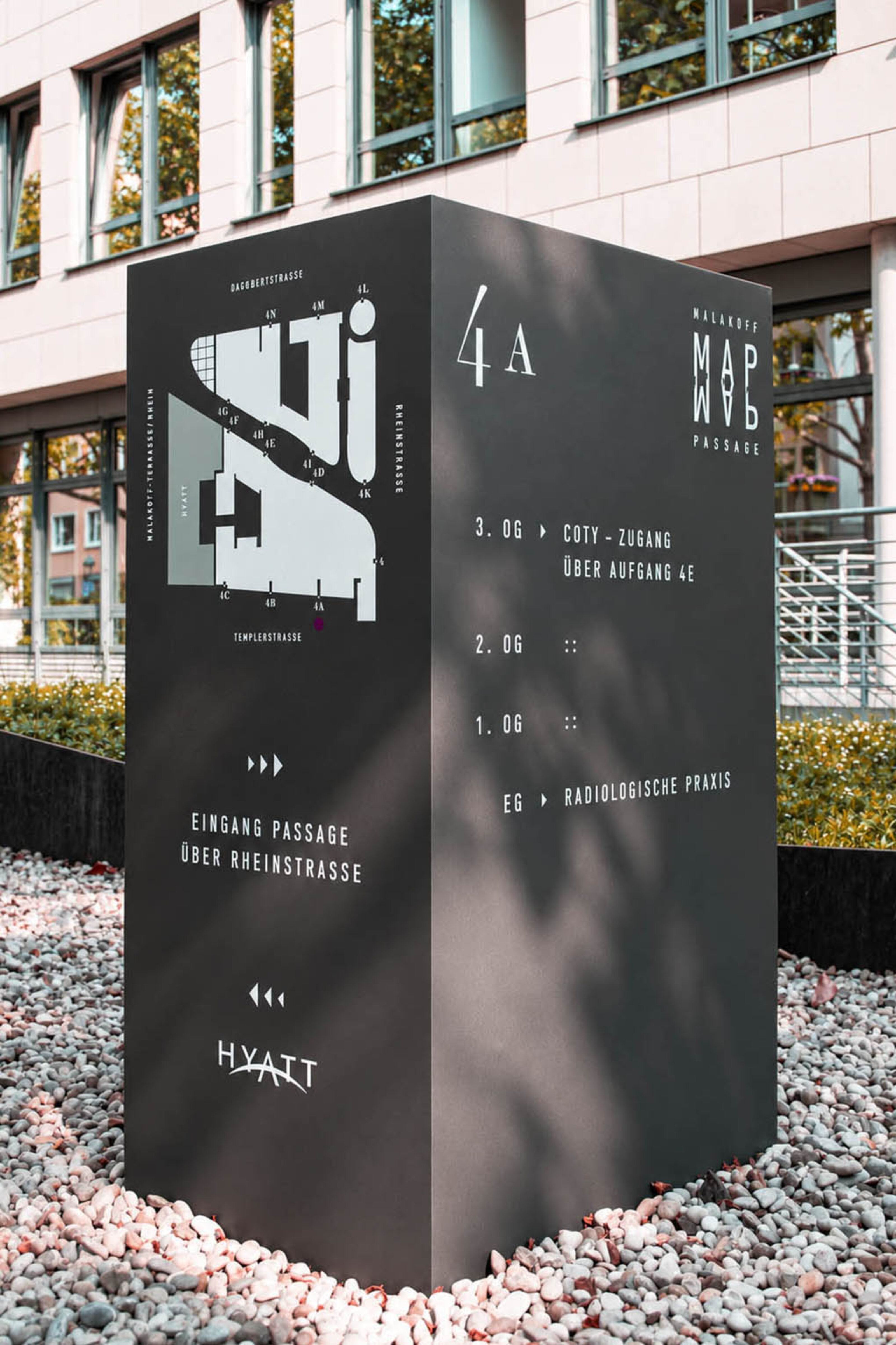
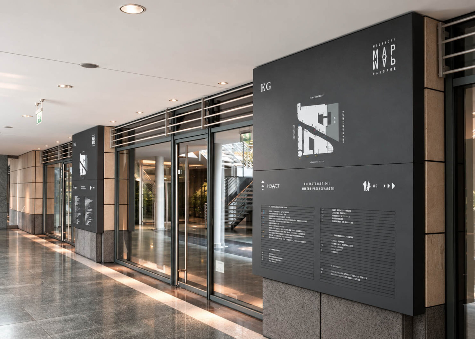


Malakoff Passage, MAP
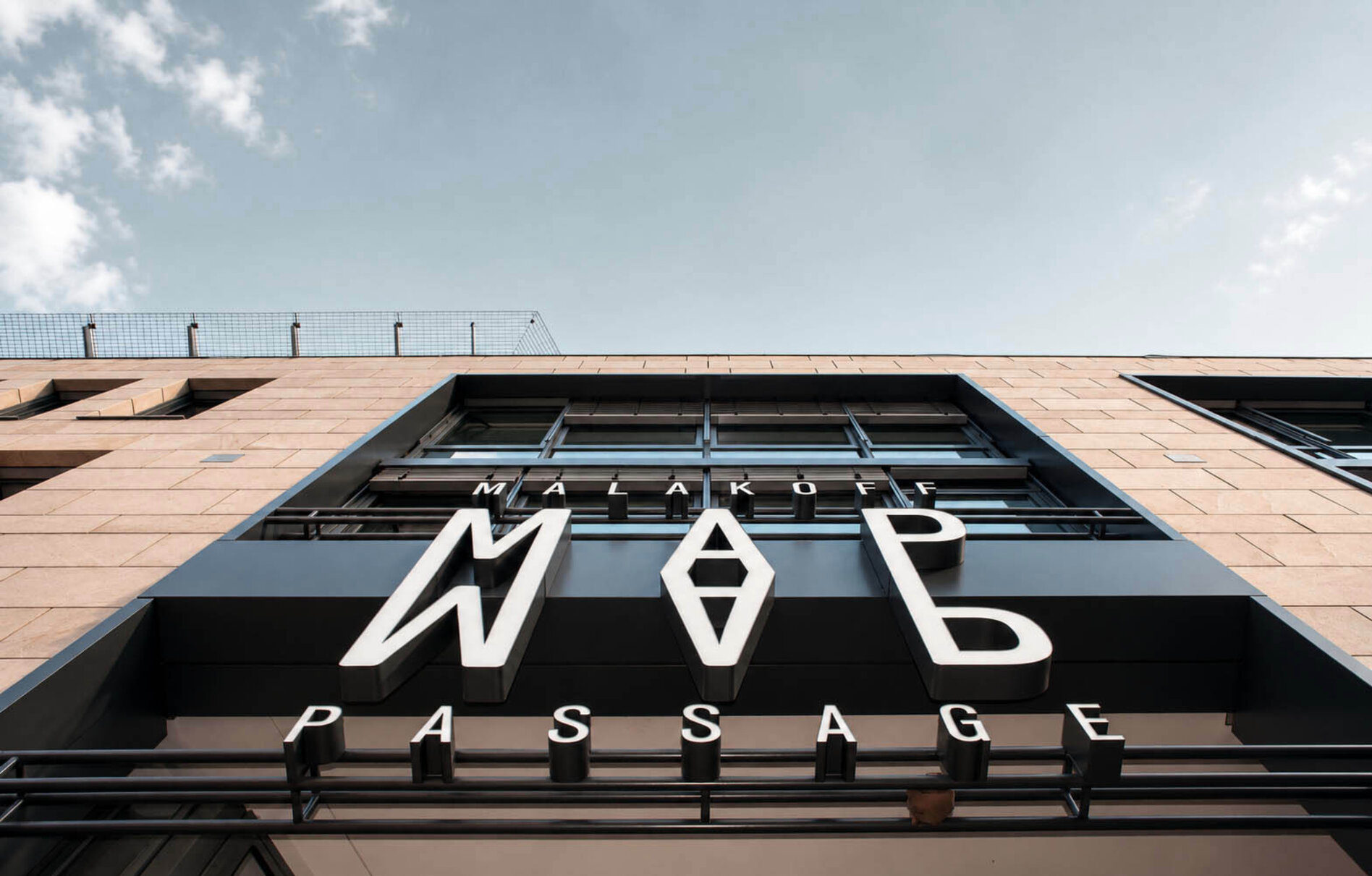
Malakoff Passage became MAP. The new name is short, graphic and also a rather fitting starting point for a wayfinding system that connects an entire building.
Nine entrances lead through the passage, from the parking garage to the upper levels. We developed a system of large letters, numbers, arrows and colours that appears in different forms across walls, glass surfaces and freestanding signs. Wayfinding becomes a graphic layer of the architecture, turning each entrance into its own point on the MAP.
*


Bürohaus am Halensee, Kronprinzendamm Berlin
*


Hotel Stadt Rosenheim, München
*

Hofmann & Voges, München
*

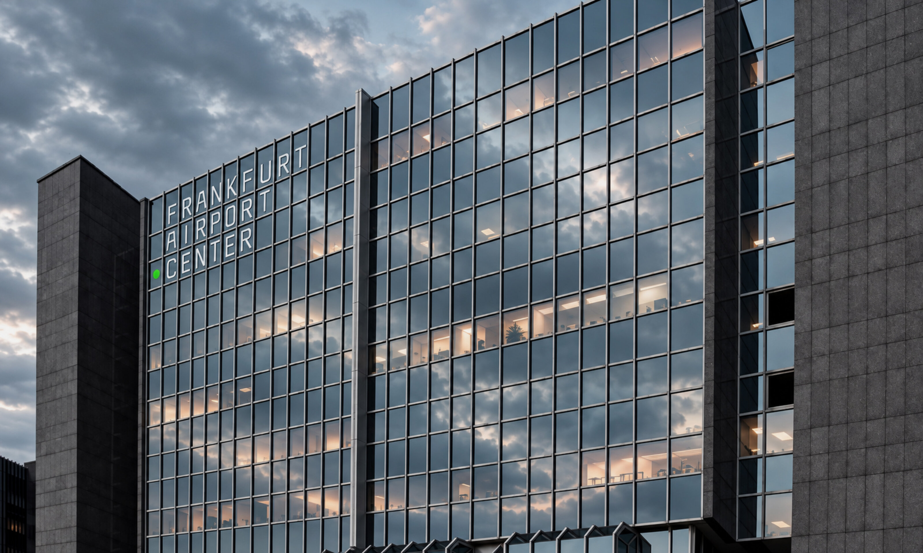
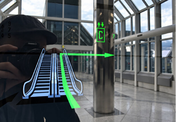
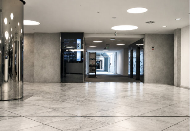
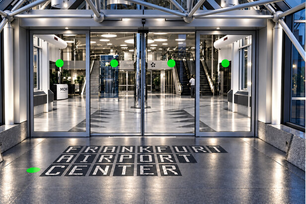
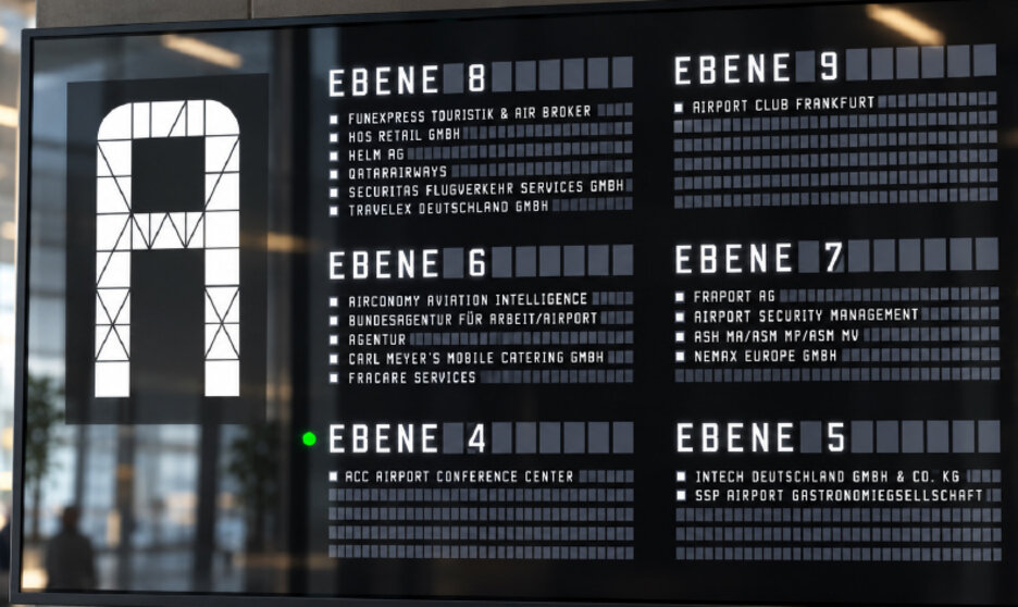
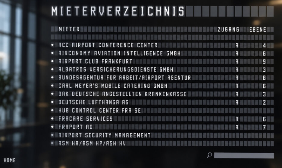
Frankfurt Airport Center, Frankfurt
*

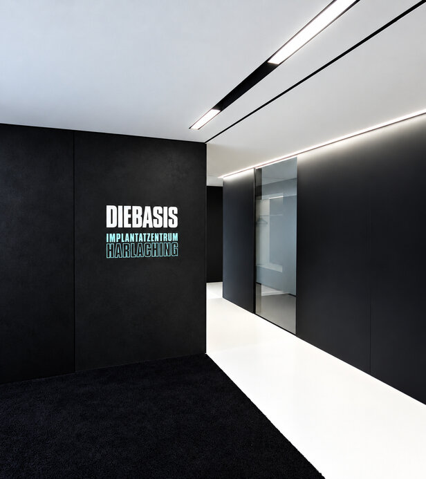
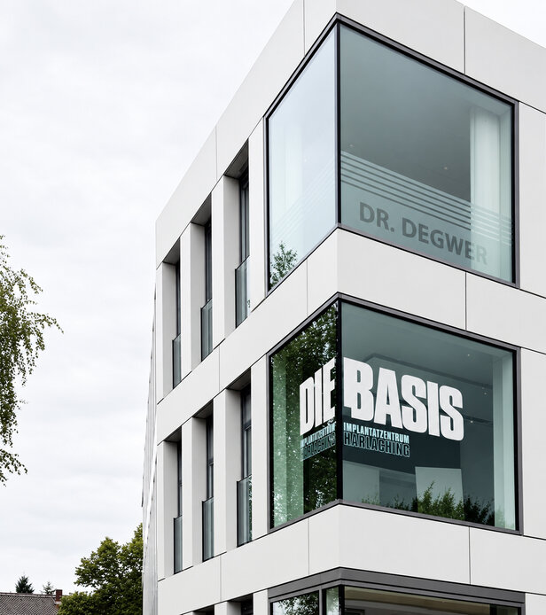
Die Basis, Implantatzentrum, München & Alztal
*


