The Chronicle of the Night. The Symbiosis of Cosmopolitan Vibe and Tactile Material Avant-Garde in the Heart of Dresden
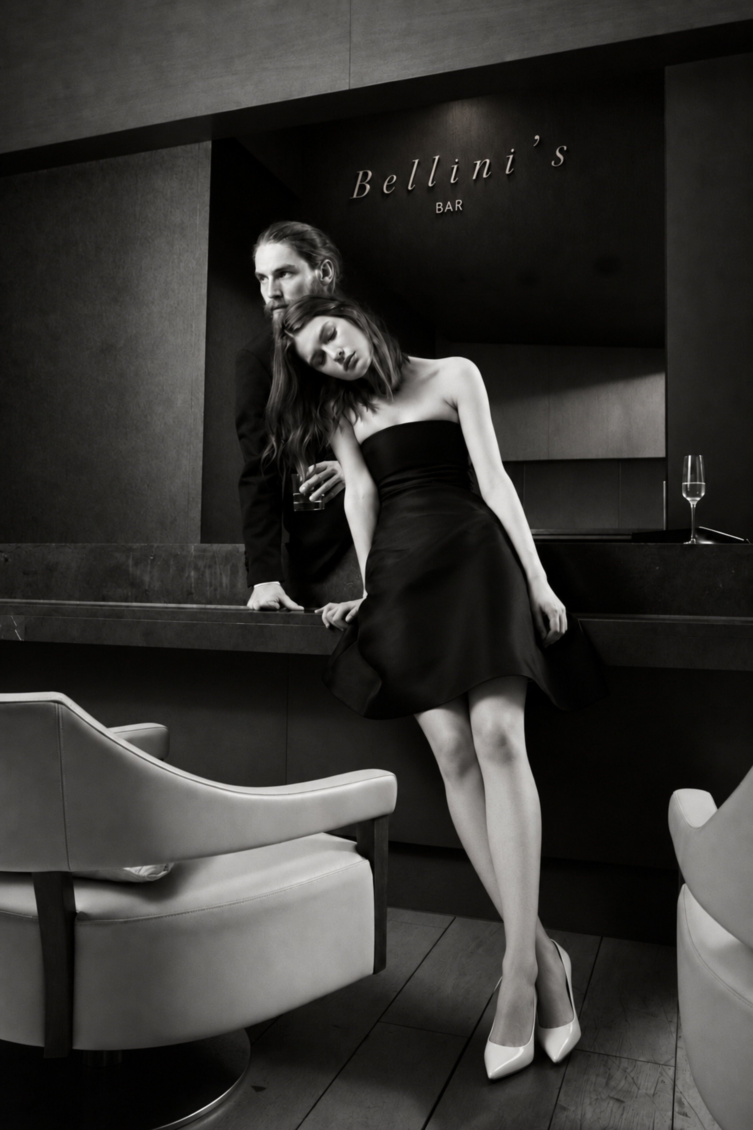
Designing a visual identity for a premium hotel in a historically sensitive location demands the courage to creatively ignore the immediate surroundings. The brand design developed for the QF Hotel deliberately bypasses the baroque clichés of Dresden's Neumarkt, transporting instead the elegance and sovereignty of a New York design hotel into the space. The corporate identity shifts the core essence of hospitality into focus: living and lingering after sunset.
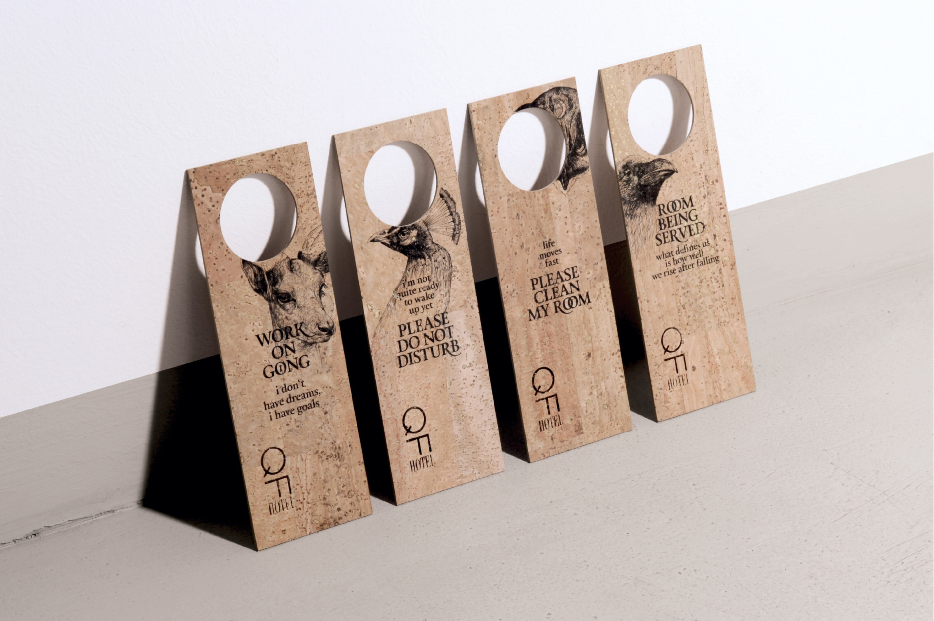
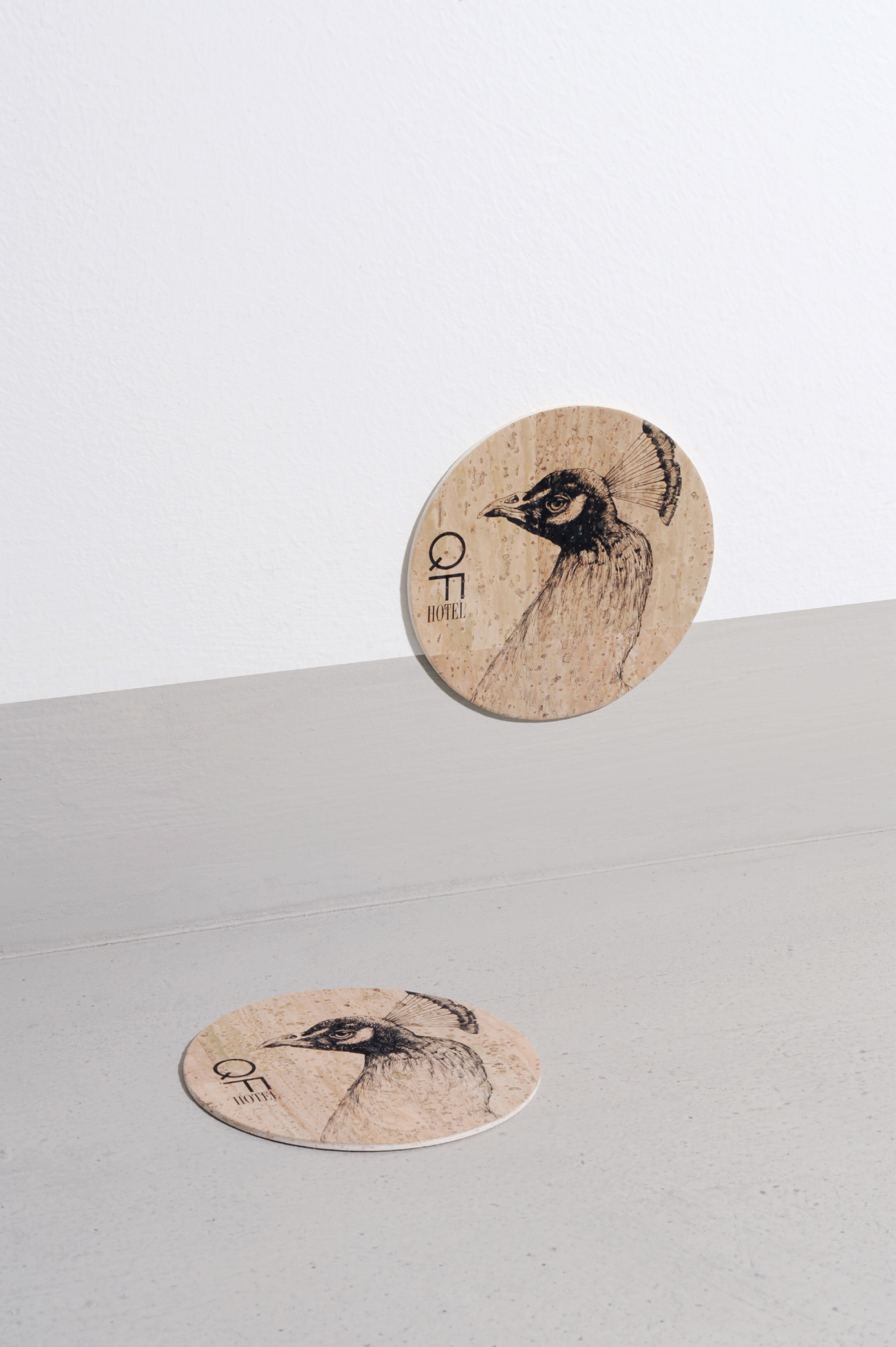
The creative framework derives its emotional depth from a unique symbolic and material composition. Serving as the actual sub-structure of the entire brand are nocturnal animals that are awake at night and sleep during the day. They form the conceptual foundation and the very basis for all hotel amenities. An authentic owl, physically present as a live model during the photoshoot, merges seamlessly in the design with further, intricately illustrated nocturnal creatures. The uncompromising rejection of traditional, stuffy hotel stereotypes is reflected in a radical choice of materials. All surfaces of the analog brand presence are built on the soft, organic texture of real cork. This unconventional substrate is contrasted by precise finishing in brown copper, creating a tense balance between raw tactility and metallic refinement.
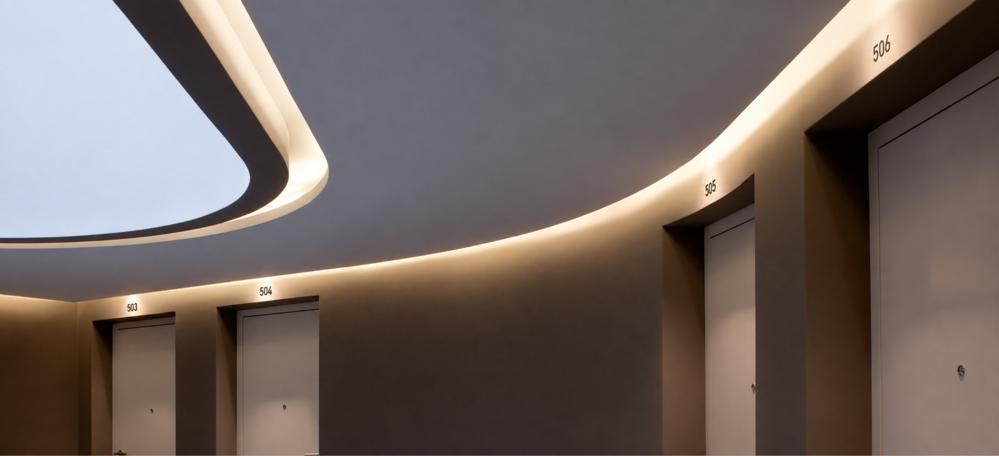
This conceptual density was systematically traced across hundreds of thousands of individual touchpoints throughout the entire hotel equipment. Every functional element—from the key card to the subtle in-room signage—forms part of a continuous narrative. A creative highlight is a custom-designed, elegantly produced booklet on sleep, serving as an intellectual companion for the guest. Within the digital architecture, in the execution of the web design and digital identity, this rigorous structure continues seamlessly. A generous grid layout and a deep, atmospheric interplay of colors yield the perfect canvas for the refined materials and the conceptual framework to resonate. A composition that defines luxury through substance.