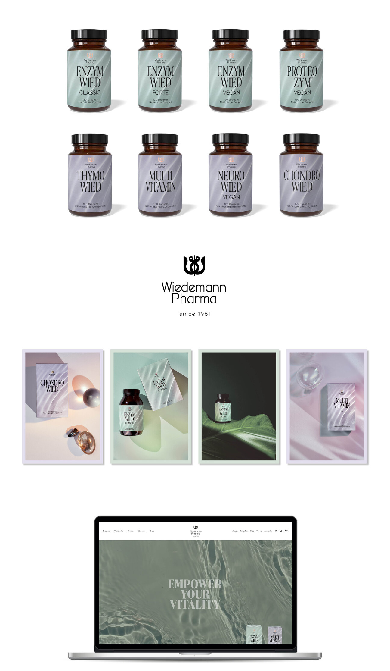


The Architecture of Vitality. A symbiosis of cellular energy and the visual poetry of natural growth.
Wiedemann Pharma has been exploring the potential of natural enzymes and micronutrients since 1961. For the next chapter of the brand, we developed a visual identity that brings its scientific background into a more contemporary, expressive world.
The imagery moves between the botanical and the human. Delicate plants emerge from deep shadows, water catches the light, and portraits introduce individual stories and personalities. Nature appears in close-up, sometimes almost abstract, revealing the textures and structures of living things. Deep mineral greens, soft rose and violet tones create a layered palette, with black giving the compositions depth.
Typography introduces another rhythm. Characterful typefaces, precise arrangements and unexpected combinations give the identity its graphic signature. The visual language extends from the logo and packaging to the website and online shop, where imagery, typography and scientific information come together in carefully composed layouts.
An identity shaped by the relationship between nature and science, with a visual world that continues to unfold across every application.
Photography by Sarah Fürbringer